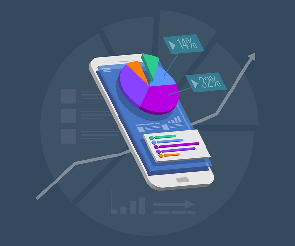
7 Awesome Data Visualization Tools
If your company is dealing with Big Data, Data analytics and visualization is a must-have tool to understand and gain insights effectively. There are several tools available in this sector that promise to convert raw data and produce it as solutions that are easily understandable. These solutions can be in the form of charts, videos, infographics or even highly engaging and intuitive presentation that uses Virtual Reality and Augmented Reality (VR & AR). Here are the top 7 data analytics and visualization tools that you can hire to get the most out of your data.
1. Tableau
Tableau is one of the most widely used data visualization software due to its user-friendly, intuitive design, and excellent official supporting documentation. This data analytics and visualization tool are available in five different versions – Desktop, Server, Online, Mobile, and free-to-use Tableau Public. It has the capacity to produce interactive visualizations that are compatible with huge and very fast-changing data sets used in Big Data operations involving artificial intelligence and machine learning applications. It is designed to work great with almost all advanced database solutions such as Hadoop, Amazon AWS, My SQL, SAP, and Teradata.
2. Sisense
This tool is smartly designed to provide a full stack analytics platform with ease of use. The interface offers users a chance to simply drag and drop charts and more complex graphics for achieving interactive visualizations without much of a hassle. The tool has the capability to gather data from multiple sources and query them instantaneously along with an option to share the dashboard across organizations. Sisense is a powerful tool for people who are experienced in this field and can be a little overwhelming for newcomers.
3. Plotly
Plotly is a web-based data visualization platform that lets the user create simple to complex charts directly inside their web browser. It offers a clean, intuitive and fully-featured interface for free, but its commercial package provides more user-friendliness and support. Its ability to enable more complex and sophisticated visualization is a direct result of integration with analytics related programming languages such as R, Python, and Matlab.
4. FusionCharts
This Javascript-based data analytics and visualization tool has the ability to produce 90 different chart types and integrates a large number of platforms and frameworks to offer optimum flexibility. It is one of the leaders in the paid-for market simply because it offers many live templates where users can simply plug in their data instead of starting one from scratch.
5. Google Charts
Google is at the forefront of technology and it stays the course by providing an entire set of data visualization tools that support various data formats including geolocation and offers a variety of outputs. But keep in mind that Google Charts are for people who have worked with data before and can code in JavaScript to make the best use of this amazing tool.
6. QlikView
QlikView tool is a major vendor that competes for supremacy with Tableau since it also provides a wide feature range and high customization setup. It does take time to get used to it, but can be very powerful when used to its full potential. There are numerous third-party resources available online for this clean and clutter-free tool. It additionally offers powerful business intelligence, analytics, and enterprise reporting.
7. Datawrapper
Datawrapper is the perfect tool for media organizations that are looking for creating simple charts to present statistics. It’s simple and clean interface allows easy CSV data upload, to create simple charts and maps that can be quickly embedded into reports.
Data analytics and visualization tools are abundantly available and seeking the best one for your organization can be difficult. It is better to seek the expertise of consultants such as our organization to get the most out of your Big Data.
Stay up to date on what's new

About the Author

Recommended Posts
28 Apr 2023 B2B
Utilizing SAP Analytics Tools to Turn Your Data Into Valuable Insights!
SAP is widely known for its brilliant abilities and functionalities, the foremost being Data Analysis. The newest version of SAP ERP is the SAP Data and Analytics Solution. It has……
18 Feb 2022 B2B
Top 10 Data and Analytics Trends Ruling the Roost in 2024
Over 95% of businesses struggle to manage unstructured data in their day-to-day operations. Inability to decipher data prevents them from navigating the market successfully, making business forecasts, and customizing their……
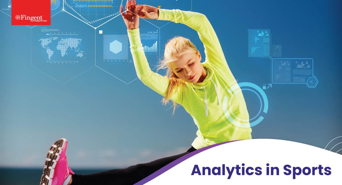
12 Sep 2020 Sports
Why Sports Analytics is a Crucial Ingredient in Today’s Match Winning Formula
Analytics in Sports: Redefining the Tactics of Winning Games with Statistical Data Sports used to be simple. Play the game and compete to win. Entertainment value aside, athletes and teams……

22 Jul 2020 Education
Prepare for the Future of Digital Innovation with these 10 Services From Fingent
10 Services Offered by Fingent to Prepare Your Business for the Future of Digital Innovation Introduction Robotic Process Automation Business Continuity Planning Contactless Services Custom LMS | eLearning Business Process……
Featured Blogs


Stay up to date on
what's new