Tag: Tableau
Step-by-Step Guide To Using Tableau In Data Visualization
Organizations now have access to more data than before. Earlier, data were not considered important enough and remained severely underutilized. Today, we witness a complete reversal, as data have become a pivotal element in innumerable processes governing an organization’s functioning. This value is not simply a result of procuring data on unclassified stacks, but assimilating them and gathering the needed insights that potentially bring about transformation.
Insights from data are made discernible and are put into plain view via dashboards. They bring into place a new way to understand complex data sets by projecting the values into visual forms like charts, graphs, bars, lines, dots, etc., known as data visualization. The process collates data in varied forms from a broader web of sources to unravel insights. To assist with this is a plethora of business intelligence tools that companies can utilize to visualize their data sets.
Tableau has emerged as a leader among business intelligence tools and stood out from other BI platforms, chiefly because of its powerful, interactive visualization dashboards that discern and quantifies complex data sets into easily understandable visual forms. Being a market-leading business intelligence platform, Tableau aids individuals, teams and organizations visualize and analyze their data. Its interactive dashboard allows analysts to engage with live data sets to get a better overview of the results.
Owing to its innovative and embedded analytics platform, Tableau has been featured as the best in its category by the global market research firm Gartner. Accordingly, Gartner’s Magic Quadrant for Analytics and Business Intelligence Platforms mentioned Tableau as a leader, consecutively for the sixth time based on its customer-focused innovation and real-world value in helping data-driven enterprises solve their business challenges right away.
Related Reading – Five Questions to Ask While Considering Data Visualization Tools

Fig. 1 – Gartner Magic Quadrant for Analytics and Business Intelligence Platforms, Source – Gartner
Tableau combines laser-focus, efficiency and feature-rich elements that determine how people see and understand data. All this comes integrated into a robust and scalable platform, that lets you harness data needed to run even the world’s largest organizations. What Tableau brings to the table is an interactive experience, where we can directly control or modify the data sets in real time to extract intelligent insights instead of just viewing them on the dashboard.
Tableau Dashboards
The worksheet, dashboards and layout containers constitute the three main elements of Tableau. The powerful dashboards integrated with Tableau remain one of its core components. It essentially simplifies the process of quantifying data through features like drag-and-drop and side-by-side comparisons. Such an approach towards understanding data allows more transparency in business processes, which lets you closely monitor, evaluate and forecast performance levels.
Together all the worksheets when combined together form the basis for a dashboard. Every single worksheet contains visualizations of data obtained from a range of sources, which can be grouped together to create a single dashboard. You can even include several dashboard objects that enhance the interactivity and visual appeal. Layout containers, whether horizontal or vertical perform the role of clustering objects together that helps change how the dashboard responds in accordance with user navigation.
Tableau’s dashboards also take visualization a cut above through its several built-in features like story points and device designer. They bring into the picture an overview of all the metrics and KPIs that define a process that helps with forecasting. Later on, a business can utilize these data to put up a comparison with the previous values and ascertain the effect of each action as well as find ways to improve them.
Related Reading: Business Intelligence Vs Business Analytics – What’s Best For Your Business
How to Use Tableau?
You just need to follow the below 3-step mantra to use Tableau:
- Connect to data
- Play around with the UI
- Create visualizations
1. Connect to Data
Connect to your data is the initial thing to do while starting to use Tableau. Connections mainly come in two types – to a local file or a server. Tableau can connect to almost any type of data server. Listed below are some of the popular databases that Tableau can connect:

2. Play around with UI
Once we import the dataset, a “Go to Worksheet” option is displayed next to the Data Source Tab at the bottom portion of the screen. A worksheet is a place where we create all of the graphs, so click on that tab to reach the following screen:
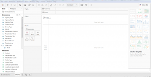 Fig. 2

Fig. 3 – Show me option in Tableau
3. Create Visualizations
Choosing the right visualization techniques for conveying insights in the most effective way is a challenging task. The below table will give you a brief idea about opting the preferred visualization method:

Insights from Using Tableau – A Typical Use Case
The working of Tableau is best understood through an example where there are different data types, each of which has the potential to reveal valuable business insights. Fingent helped one of their clients drive important business decisions by visualizing their secured and dynamic data based on their requirements.
Business need: Being part of an extremely dynamic industry, tracking the slightest changes in their ticket status is of the highest priority for the client. They needed a solution that will enable them to react quickly to varying stages of their tickets and to reduce damage. A solution that would be able to generate hassle-free, ad-hoc & secured reports for delivering accurate data visualization.
Solution: As per the requirements gathered, several dashboards and reports were designed for various levels by connecting to the Microsoft SQL server database. Refer to the screenshot below to understand how our client made use of Tableau to derive insights.
Member Dashboard Created For Fingent Clients
Member Dashboard consists of two tabs: Live tickets and Historic ticket. This dashboard visualizes the history data to derive insights for making better business decisions.
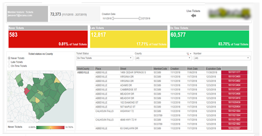
Fig. 4 – Member Dashboard
In this Dashboard, members can do a lot of analysis like the total number of different kinds of tickets, Ticket status vs County, cross tab with country wise ticket details and more. Interactive filters help the members to drill down into the dashboards with their needs for creating different subreports.
When members click on the live ticket icon navigation arrows, they are redirected to live tickets dashboard for the members.
Members view contains information formatted to aid facility operators responsible for locating. These would show at a high level how the user and its company are performing.
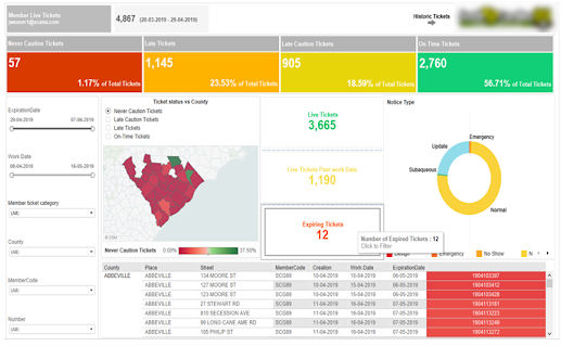
Fig. 5 – Live Tickets Dashboard
Excavator Dashboard
This dashboard view revolves around the person/entity who created the ticket. Excavator dashboard clearly helps track the lifecycle of tickets that are pending, need more attention, requires a positive response from the excavator, and those that passed the due time, etc. This dashboard also drills down the flexibility in each stage of the life cycle for better analysis and quick actions.
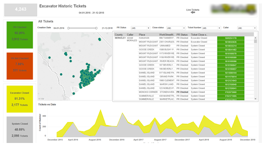
Fig. 6 – Excavator Dashboard
Damage Dashboard for Members and Excavator
This dashboard gives insights into the total damages occurred during the excavation in a plain and understandable way. Damage rate vs date, facility damaged over the years, country vs damages, damages by course, top excavation types causing damages, etc., are all covered in this dashboard.
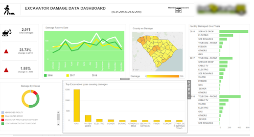
Fig. 7 – Damage Dashboard
The intention here is to give you an overview of what are the various business problems and questions, which can be answered using data visualization in Tableau and how it helped the client to drive business insights from the bulk amount of data in a synchronized way.
Related Reading – Power BI Or Tableau: The Better Choice for your Business
Conclusion
With more businesses going data-driven, the onus is on adopting a wider strategy for keeping data at the very center. Distilling insights from a mix of data obtained from a variety of sources is made easy with intuitive and easy to use BI tools like Tableau. The interactive dashboards in Tableau give rise to a new way to look at data by visualizing them, which refines our understanding of every single metric or KPI that is being displayed. Better accessibility into the dashboards and visualized data even from mobile devices further add to its flexibility.
Tableau comes inbuilt with some powerful BI tools that can do a host of other things alongside data visualization such as data stories, data analysis of workbooks, etc. With it comes the end result of churning out intelligent insights teeming with potential to bring about a transformation into the existing business processes. Besides, there is minimal effort required to start learning and using Tableau owing to its simplicity, easy navigation and other features like drag and drop interface. To sum up, Tableau fully redefines data visualization by helping companies leverage data for creating insights that drive business value. To know how your business can benefit from Tableau, get in touch with our tech experts now!
Stay up to date on what's new

About the Author

Featured Blogs


Stay up to date on
what's new


Talk To Our Experts
A Comparison Between Tableau and Power BI: The Most Powerful Leaders In The BI Market.
Business Intelligence or BI tools are a precursor of the world-altering digital technology in this modern technology landscape. Analytics plays a key role in determining which Business Intelligence tool is a better choice. This is because the more flexible the analytics platform offered by a specific BI tool is, the more it provides businesses to customize applications that need updates. Let’s take a deeper look at how Power BI is different from Tableau and which technology promises a better future for your business.
Related Reading: Read on to learn more about Business Intelligence. What it is and how your business can get the best from it.
Tableau And Power BI
Tableau was the first and foremost to come into the market. Though both Tableau and Power BI are well-known to be able to execute fine enough, Power BI has an advantage of making itself accessible to even the no-techy users, making it possess a higher adoption rate than Tableau.
On the other hand, Power BI is ranked higher on one of the key characteristics in terms of its Data Visualization, according to Gartner’s Magic Quadrant.
However, Microsoft’s Power BI has the most user-friendly features in terms of ‘completeness of vision’ or ‘Data Visualization’ capability and has been embedded within Office 365. But Tableau offers advanced functionality and it is best considered for power users.
So to choose a BI tool that is the best fit for your business, it is important to first learn about the analysis needs. In the recent decade, Power-BI and Tableau have emerged as the two powerful BI tools.
Let us look at how companies can choose the best for their business from the following key factors:
Cost
Cost of Tableau is on the higher side when it comes to larger enterprises. The primary reason for this premium cost is the need to build data warehousing. Thus, it is advisable for a startup to choose Power BI initially and then consider Tableau when required.
The professional version of Power BI costs you less than 10$ whereas, on the other end, Tableau would cost you more than 35$ per month per user.
Reporting
Power BI supports Predictive Modelling and Reporting when on the other side, Tableau opts for Data Visualization.
With Power BI, we can create visualizations by queries and natural language. Say, for instance, Cortana PDA (Personal Digital Assistant). Power BI is said to place a 3500 limit when it comes to conducting analysis on data sets.
Tableau can be the best choice when it comes to Data Visualization. With a user-friendly dashboard, Tableau allows an in-depth data analysis. As compared with Power BI, Tableau offers more visualization flexibility.
With Tableau, we are able to create 24 different types of basic visualizations. This includes heat maps and line charts.
Functionality
The functionality associated with Tableau with respect to Data Searching is on the higher side than when compared to that of Power BI.
Tableau tends to answer more queries from users as compared to Power BI.
Large Data Handling Capacities
In case of processing large chunks of data, the capacity of Tableau is over and above that of Power BI.
Power Bi handles data via import functionality and hence is slower to process large volumes of data as compared to Tableau that makes use of direct connections for the same purpose.
Data Connectors
Tableau offers, convenience for data connectors. For example, OLAP (OnLine Analytical Processing), cloud and also big data options such as Hadoop and NoSQL. Tableau can automatically determine the relationships of data that users add from various data sources. It also provides for the creation and modification of data links manually as per the company policies.
Power BI, on the other hand, can connect to user’s external sources such as SAP HANA, MySQL and JSON. It helps users connect to third-party databases and online services like Salesforce.
Thus, if connecting to a specific data house is your business requirement, Tableau is the best choice as Power BI is integrated with Microsoft’s Azure cloud platform.
Related Reading: Business Intelligence or Business Analytics. Find what is best for your business.
Deployment
Power BI is a SAAS model. Tableau, on the other hand, is available both on cloud and on-premises options. The deployment options for Power BI is lower as some business policies do not allow for SAAS deployment. Thus, in case of flexible deployment capacity, Tableau is considered the better option here, even though it is on the higher-end when the cost factor is considered.
User Interface
The user interface of Tableau allows for the creation of a customized dashboard. On the other hand, Power BI has an interface that is easy to use and intuitive. So, if easy to use is your major requisite, Power BI is the choice for your business.
Programming Tools Support
Though both Power BI and Tableau run smoothly with programming languages, Tableau can be integrated better with the R language rather than Power BI. R language provides a wide range of tools used to capture the right model of your data.
Power BI, on the other hand, also can be connected to the R language, but by using Microsoft Revolution analytics and it is made available only for Enterprise users.
Product and Customer Support
Tableau emerged in an early stage than Power BI and hence has a smaller community when compared to Tableau. The knowledge base of Tableau has three subscription categories, namely Desktop, Online, and Server.
On the other hand, Power BI offers a support functionality that is limited to users with a free account, allowing only it’s premium and pro users for faster support.
Licensing
This ultimately depends on whether you want to pay the full cost up front. If yes, then Tableau should be your first choice.
If we could put it this way, Power BI can be your best choice if you are a common stakeholder because of its intuitive drag and drop features, for which a data analyst’s experience is not crucial. Tableau can win if your choice is speed and if you have the capital to support.
Related Reading: Find how SAP HANA is becoming the game changer.
In a nutshell, both Power BI and Tableau have different functionalities which depend on the variant business requirements. The best BI tool for your business can be selected only depending on the business requirements. With the help of expert IT consultants, you can make the right choice for your business. Contact Fingent today!
Stay up to date on what's new
About the Author
Featured Blogs
Stay up to date on
what's new