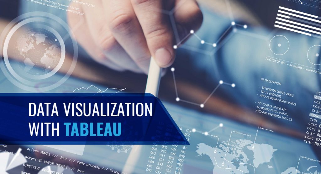
Tag: Data visualization
Businesses are always on the lookout for ways to optimize processes and gain greater visualization. When processes work efficiently, the output of the product is higher. This leads to workflows that run smoothly with minimum errors and higher capacity. A good reason for the growing popularity of process automation and visualization.
Automation and visualization are the future of the business strategy. Gone are the days of carefully filling in graph paper by hand. Today, process automation and visualization help enterprises up their game by allowing access to real-time models capable of accurately capturing the nuanced data sets.
In this blog, we will expand on how enterprises can up their game with process automation and visualization.
How Enterprises Can Up Their Game with Process Automation and Visualization
Data visualization enables human operators to manage vast sets of data, glean insights from different information sources, and perform operations more intuitively and strategically.
In the current data-immersed world, data visualization can significantly add value by conveying large datasets visually. What does this mean for your business? This means a better grasp of critical customer data.
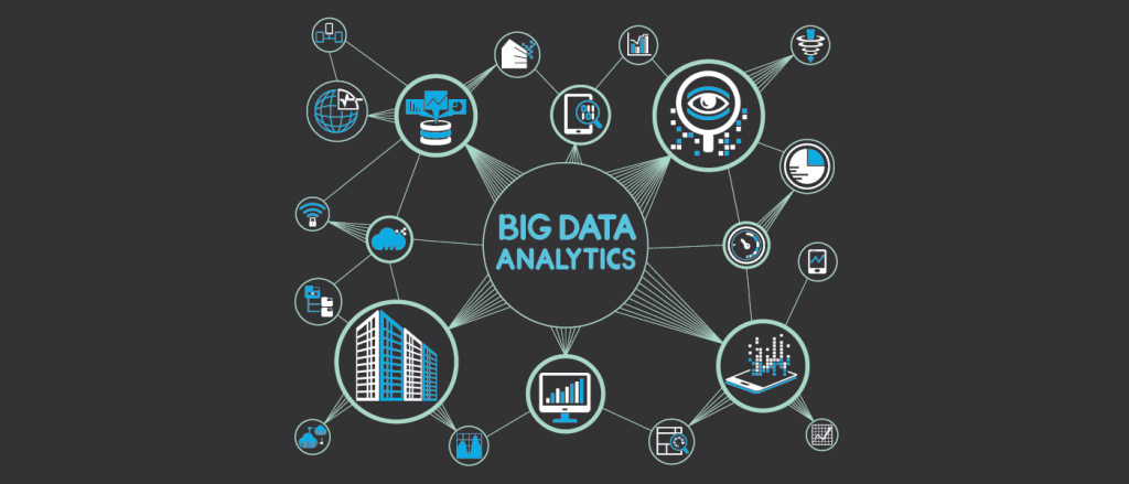
According to the IDC, the collective sum of the world’s data is predicted to grow to 175 zettabytes by 2025. Processing such large amounts of data can become a problem.
By allowing automation and the right programs to sort out your business data, you can generate graphs. You will be able to use these graphs to up your game in business competition.
Data visualization offers businesses the hope of getting a grasp on data. Fortunately, the human brain can process and recognize trends, identify potential issues, and forecast future development from clear visual displays.
Read more: How Powerful Is Data Visualization With Tableau
Look Out for Upcoming Powerful Trends in Automation and Visualization
1. AI and ML
Artificial Intelligence and Machine Learning render visualization more accurate and efficient. These technologies enable businesses to handle customer feedback without bias. Process automation allows you to sort the feedback in real-time and according to your specifications.
2. Unlock Big Data with Data Democratization
Large amounts of data are hard to understand. It requires data scientists and other experts to unlock its treasures. Not anymore. Advanced no-code data analysis platforms can automate your data process. This is called the democratization of data.
Democratization of data leaves it malleable and easy to display allowing your employees any level of tech support. When this is paired with the data visualization type, it can unlock big data results for teams at all levels of your organization.
3. Video Visualization Is Here to Stay
Young and old alike tend to retain the information they see over what they hear. This would mean that video infographics will be the future.
Video applications for business strategy and customer retention are key areas for future strategic data visualization implementation.
4. Real-time Visualization for Early detection
Knowing a problem at the exact moment it arises can assist businesses in customer retention and brand presence. Early detection can have a dramatic impact on the bottom line.
Process automation can help run a dashboard that allows users to submit their error reports to your customer support. Then the reviews can be tagged and analyzed using sentiment analysis.
5. Mobile Optimized Visualization
An increased number of people access the internet on their mobile devices. Your business needs mobile-optimized data visualization to stop customer churn.
It enables you to know if your potential customers are learning about your services through social media or an online review board. Though mobile-optimized visualization is an easy step, it is critical to keep your business on top of the game.
Read more: 7 Awesome Data Visualization Tools

Business Applications of Process Automation and Data Visualization
1. Financial Service and Insurance
The finance service industry is a prime candidate for process automation and data visualization. Two top requirements of this industry are customer response time and compliance with strict regulations.
When automated, quick decisions can be made based on pre-defined rules like loan applications, claims processes. businesses can use data visualization to make reliable predictions or risk calculations in the financial industry.
Insurance fraud can cost billions of dollars damage. Process automation and data visualization can improve fraud detection.
Read more: Deploying RPA for Finance, Healthcare, and IT Operations.

2. Distribution and Logistics
Process automation and data visualization can minimize costs by planning transport promptly, reducing costs of downtimes and maintenance.
3. Sales
Data visualization can greatly improve relationships with your customers. It helps you know the needs of your customers better, and address each of them directly in real-time.
4. Marketing
Data visualization and process automation can reduce marketing costs substantially. These technologies can help evaluate the demographics, location, transactions, and interests of your customers. Visualizing these details can help you understand their purchase patterns.
Thus, data visualization can be used to create and target new customer segments. Cross-selling is another advantage. At the same time, data visualization may reveal that customers are dissatisfied. Identifying this and responding quickly can counteract the situation to retain your customer base.
5. Healthcare
Process automation and data visualization enable cheaper healthcare. It can help predict disease occurrence and proactively propose countermeasures.
6. Science and research
Visualization enables the evaluation of the data of an experiment. Process automation and visualization can be advantageous especially when an experiment generates large amounts of data within seconds.
7. Production
Large amounts of data are generated during production. Using process automation and visualization can help plan preventive maintenance and prevent production delays or downtimes.
Prepare Your Business For The Future With Fingent
Fingent helps enterprises automate document-based processes. We can help you create safer sharing and collaboration. Our platform allows you to create teams, assign roles and privileges, and streamline communication.
Fingent’s partner integrations allow you to use it together with your existing software. Our top-level measures protect our users’ data. The encryption we provide ensures content integrity and prevents alteration.
Fingent top custom software development company can help your organization reach the goal of paperwork elimination. Doing so can lead to efficient resource distribution throughout the organization.
What’s more, it reduces carbon footprint. Our experts bring along specializations supported by scientific rigor and in-depth knowledge of advanced techniques to design, develop, and deploy solutions for process automation and visualization.
Give us a call today and let’s get talking.
Stay up to date on what's new

About the Author

Featured Blogs


Stay up to date on
what's new


Talk To Our Experts
What is Exploratory Data Analysis?
Exploratory Data Analysis (EDA) is a statistical approach used to analyze data and produce descriptive and graphical summaries. Analysts may or may not use a statistical model, but EDA primarily foresees what the data can reveal to us beyond formal modeling.
With EDA you can analyze your data as it is, without the need to make any assumptions. EDA further validates and expands the practice of using graphical methods to explore data. EDA gains insights from statistical theories that give easily decipherable insights. Exploratory data analysis techniques can also be used to derive clues from data sets that are unsuitable for formal statistical analysis.
Exploratory Data Analysis displays data in such a way that puts your pattern recognizing capabilities to full use. The patterns are evident to an examination that is careful, direct, and most importantly assumption-free. Thus, you can understand relationships among variables, identify problems such as data entry errors, detect the basic data structure, test assumptions, and gain new insights.
Purpose of Exploratory Data Analysis
The prime purpose of EDA is to study a dataset without making any assumptions. This helps the data analyst to authenticate any assumptions made in devising the problem or operating a particular algorithm. Researchers and analysts can, therefore, recommend new schemes that were not previously considered.
In other words, you apply inductive reasoning to obtain results. These results may be in opposition to the theories that directed the initial data collection process. Thus, EDA becomes the driver of transformation. This approach allows you to oppose planned analyses and probe assumptions. The ensuing formal analysis can continue with better credibility. EDA techniques have the potential to uncover further information that may open new areas for research.
Role of EDA in Data Science
We need to understand the role of EDA in the whole process of data science. Once you have all the data, it has to be processed and cleaned before performing EDA. However, after EDA, we may have to repeat the processing and cleaning of data. The cleaned data and results obtained from this iteration are further used for reporting. Thus, using EDA, data scientists can rest assured that the future results would be logical, rightly explained, and relevant to the expected business circumstances.
EDA helps to clean the feature variables that are to be used for machine learning. Once data scientists get familiarized with the data sets, they may have to go back to feature engineering since the early features may be unable to serve the objective anymore. After completion of the EDA, data scientists obtain a feature set that is required for machine learning. Each dataset is generally explored using multiple techniques.
Read More: Top 10 Must-Know Machine Learning Algorithms in 2020
Methods of Exploratory Data Analysis
Exploratory data analysis is carried out using methods like:
- Univariate Visualization – This is a simple type of analysis where the data analyzed consists of a single variable. Univariate analysis is mainly used to report the data and trace patterns.
- Bivariate visualization – This type of analysis is used to determine the relationships between two variables and the significance of these relationships.
- Multivariate visualization – When the data sets are more complex, multivariate analysis is used to trace relationships between different fields. It reduces Type I errors. It is, however, unsuitable for small data sets.
- Dimensionality Reduction – This analysis helps to deduce which parameters contribute to the maximum variation in results and enables fast processing by reducing the volume of data.
Using these methods, a data scientist can grasp the problem at hand and select appropriate models to corroborate the generated data. After studying the distribution of the data, you can check if there’s and missing data and find ways to cope with it.
Then comes the outliers. What are your outliers and how are they affecting your model?
It’s always better to take small steps at a time. So you need to check if you can remove some features and still get the same results. More often than not, companies just venturing into the world of data science and machine learning find that they have a lot of data. But they have no clue how to use that data to generate business value. EDA techniques empower you to ask the right questions. Only specific and defined questions can lead you to the right answers.
Exploratory Data Analysis: Example with Python
Read More: Why you should migrate to Python 3
Suppose you have to find the sales trend for an online retailer.
Your data set consists of features like customer ID, invoice number, stock code, description, quantity, unit price, country, and so on. Before starting, you can do your data preprocessing, that is, checking the outliers, missing values, etc.
At this point, you can add new features. Suppose you want the total amount. You multiply quantity and unit price to get this feature. Depending on the business requirement, you can choose which features to add. Moving on, by grouping the countries and quantity or total amount together, you can find out which countries have maximum and minimum sales. Using Matplotlib, seaborn, or pandas data frame you can visually display this data. Next, by grouping the year and total amount, you can find out the sales trend for the given number of years. You can also do the same for each month and find you out which time of the year has shown a spike or drop in sales. Using this same method, you can identify further problems and find out ways to fix them.
Read More: How to Use Data Analytics to Improve Enterprise Sales Numbers
The key to exploratory data analysis is to first understand the LOB and get a good hang of the data to get the desired answers. Get in touch with us to know more about EDA.
Stay up to date on what's new
About the Author

Featured Blogs
Stay up to date on
what's new
Talk To Our Experts
Impact Of Data Visualization On Future Technologies
Data Visualization is no more art. With emerging cognitive frameworks, multidimensional imaging and intelligence; data visualization is opening new horizons in being able to visualize large chunks of complex data. Being the modern substitute for visual communication, Data Visualization has enabled easy decision making for businesses.
Data Visualization Impacts
Data VIsualization helps data to be understood in visually interactive forms such as patterns, correlations, graphics and so on. It delivers a better understanding of the business states and in developing patterns that provide solutions and insights. The impacts of Data Visualization are as follows:
- Display of critical data in visually interactive forms.
- Can display trends over any period of time.
- Can grasp large chunks of complex data in an easy visual form.
- Prevents chances of errors in decision-making.
- Helps in identifying key features that impact business results.
- Helps in developing a forecast for future steps to be taken.
Data Visualization – Why is it Important For Your Business and How?
It is a fact that 90 percent of the information transmitted to the brain is visual, and high-quality infographics are thirty percent more preferred than plain text. This figure implies how Data Visualization can be used to help your business achieve heights in today’s data-driven sphere!
Data Visualization benefits are as follows:
- Data visualization can cut short business meetings by 24%, reports American Management Association statistics.
- A report by Tableau, reveals that managers who use the tools for visual data recovery find the correct required data, whereas, 48 percent more than the others need help from their IT staff and other personnel.
- The advanced analytics capability of Data Visualization tools makes it 5 times easier in decision-making processes than their competitors.
- Specific business intelligence that has effective data visualization techniques, provide an ROI of $13.01 for each dollar spent, states report based on Nuclear Research.
Related Reading: Find what you need to ask and learn, before choosing your data visualization tool.
How Is Data Visualization Crucial For Big Data?
Data Visualization affects the approach of analysts who work with data. Getting more insights and being able to respond to issues more quickly are two among the numerous key advantages of Data Visualization. In addition to these, real-time support to customers and monetization of Big Data in Retail Banking are also made possible.
Data Visualization in the form of infographics and other visual tools allows businesses to run smoothly and also speeds up analysis processes. This is because, when in visual form, it becomes easier to view data rather than viewing on spreadsheets.
The future of data visualization with Big Data maximizes the potential and increases productivity by providing infographics that can be transformed into critical insights.
The Future Of Data Visualization
- Data On-Demand
There are 28 zerrabytes (a trillion gigabytes) of data that is being created every year. This figure shows how much data is readily available for anything and certainly everything under the sun. The devices that are interconnected with these multiple streams of data undoubtedly improves efficiency and is also intensely accurate.
- Data Storing Into Database With a Clear Purpose
The large chunks of data collected entirely need not be stored in the database. For this, data charts and animations using the relevant data were used.
For instance, Bloomberg has a system named Scatteract. With Scatteract, it is possible to read each pixel using the OCR (Optical Character Recognition) technique and convert data points from a particular image to data in tables.
Data visualization is said to be fully understood by algorithms as well in the near future.
Data Visualization With Virtual Reality – Virtualitics
There is nothing better than being able to communicate insights via interactive visuals in real-time. Augmented reality or cue virtual reality technologies are successful and efficient.
According to experts, the market size of augmented virtual reality is expected to be worth about $209 billion by 2022 globally. And the software market size for virtual reality is expected to be worth $6.4 billion by 2021 globally.
An example of virtual reality enhancing the future of Data Visualization is the ‘Project Night At The Museum’. It is a 3D based mobile-friendly observation of virtual reality like a museum that showcases the ‘space’ and so on.
When it comes to Virtual Reality And Augmented Reality, the technology called Virtualitics or even known as ‘Immersive Analytics’ provides visual control to viewers to explore data sets, Artificial Intelligence support or smart mapping support made possible by multi-dimensional data analysis.
Virtualitics provides a 3D collaborative environment which is used to link data with pattern recognition. This is used to retrieve various multi-dimensional relationships. For instance, Scatter Plots are a good example of 3D Visualization provided by Virtualitics. Scatter Plots help in combining different metrics together to form a single and simple graphics.
Related Reading: Find the right difference between data visualization and data analytics.
The Three Big Changes In Data Visualization
As Data Visualization is evolving at the technological forefront, there is a constant increase in the number of analytics tools. One set of analytical tools is the Rapid Prototyping tools and the other being Charting Libraries. The main three changes identified are as follows:
- Disruptive Tools: Disruption in Data Analytics and Visualization
- Application In Many Industry Verticals: Marketing Analytics, HR and Product Analytics, Manufacturing, Healthcare, Education, Finance, IT and so on.
- Cross-pollination of different people to join the field of data science: This is a cross-pollination of ideas from different sectors such as astronomy, arts, science and so on.
Related Reading: Read on to know about 7 amazing data visualization tools.
Data Visualization As An Investment
According to the recent Data Connectivity Outlook Survey by Progress, 59 percent of organizations said that they use Data Visualization techniques and it has profoundly converted into investment.
For instance, medical imaging technologies such as MRI scans, etc., have led to R&D companies that provide medical data visualization solutions.
IoT, AI, and machine learning are continuing to contribute to Data Visualization by being able to draw critical insights derived from these data.
Data Visualization is the easiest way to provide a clear picture to depict any complex data and to retrieve useful insights. To learn more about how Data Visualization can enhance your business efficiency, get in touch with our experts now!
Stay up to date on what's new
About the Author

Featured Blogs
Stay up to date on
what's new
Talk To Our Experts
Step-by-Step Guide To Using Tableau In Data Visualization
Organizations now have access to more data than before. Earlier, data were not considered important enough and remained severely underutilized. Today, we witness a complete reversal, as data have become a pivotal element in innumerable processes governing an organization’s functioning. This value is not simply a result of procuring data on unclassified stacks, but assimilating them and gathering the needed insights that potentially bring about transformation.
Insights from data are made discernible and are put into plain view via dashboards. They bring into place a new way to understand complex data sets by projecting the values into visual forms like charts, graphs, bars, lines, dots, etc., known as data visualization. The process collates data in varied forms from a broader web of sources to unravel insights. To assist with this is a plethora of business intelligence tools that companies can utilize to visualize their data sets.
Tableau has emerged as a leader among business intelligence tools and stood out from other BI platforms, chiefly because of its powerful, interactive visualization dashboards that discern and quantifies complex data sets into easily understandable visual forms. Being a market-leading business intelligence platform, Tableau aids individuals, teams and organizations visualize and analyze their data. Its interactive dashboard allows analysts to engage with live data sets to get a better overview of the results.
Owing to its innovative and embedded analytics platform, Tableau has been featured as the best in its category by the global market research firm Gartner. Accordingly, Gartner’s Magic Quadrant for Analytics and Business Intelligence Platforms mentioned Tableau as a leader, consecutively for the sixth time based on its customer-focused innovation and real-world value in helping data-driven enterprises solve their business challenges right away.
Related Reading – Five Questions to Ask While Considering Data Visualization Tools

Fig. 1 – Gartner Magic Quadrant for Analytics and Business Intelligence Platforms, Source – Gartner
Tableau combines laser-focus, efficiency and feature-rich elements that determine how people see and understand data. All this comes integrated into a robust and scalable platform, that lets you harness data needed to run even the world’s largest organizations. What Tableau brings to the table is an interactive experience, where we can directly control or modify the data sets in real time to extract intelligent insights instead of just viewing them on the dashboard.
Tableau Dashboards
The worksheet, dashboards and layout containers constitute the three main elements of Tableau. The powerful dashboards integrated with Tableau remain one of its core components. It essentially simplifies the process of quantifying data through features like drag-and-drop and side-by-side comparisons. Such an approach towards understanding data allows more transparency in business processes, which lets you closely monitor, evaluate and forecast performance levels.
Together all the worksheets when combined together form the basis for a dashboard. Every single worksheet contains visualizations of data obtained from a range of sources, which can be grouped together to create a single dashboard. You can even include several dashboard objects that enhance the interactivity and visual appeal. Layout containers, whether horizontal or vertical perform the role of clustering objects together that helps change how the dashboard responds in accordance with user navigation.
Tableau’s dashboards also take visualization a cut above through its several built-in features like story points and device designer. They bring into the picture an overview of all the metrics and KPIs that define a process that helps with forecasting. Later on, a business can utilize these data to put up a comparison with the previous values and ascertain the effect of each action as well as find ways to improve them.
Related Reading: Business Intelligence Vs Business Analytics – What’s Best For Your Business
How to Use Tableau?
You just need to follow the below 3-step mantra to use Tableau:
- Connect to data
- Play around with the UI
- Create visualizations
1. Connect to Data
Connect to your data is the initial thing to do while starting to use Tableau. Connections mainly come in two types – to a local file or a server. Tableau can connect to almost any type of data server. Listed below are some of the popular databases that Tableau can connect:

2. Play around with UI
Once we import the dataset, a “Go to Worksheet” option is displayed next to the Data Source Tab at the bottom portion of the screen. A worksheet is a place where we create all of the graphs, so click on that tab to reach the following screen:
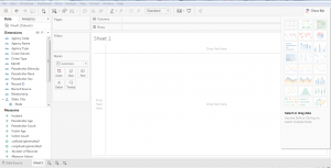 Fig. 2

Fig. 3 – Show me option in Tableau
3. Create Visualizations
Choosing the right visualization techniques for conveying insights in the most effective way is a challenging task. The below table will give you a brief idea about opting the preferred visualization method:

Insights from Using Tableau – A Typical Use Case
The working of Tableau is best understood through an example where there are different data types, each of which has the potential to reveal valuable business insights. Fingent helped one of their clients drive important business decisions by visualizing their secured and dynamic data based on their requirements.
Business need: Being part of an extremely dynamic industry, tracking the slightest changes in their ticket status is of the highest priority for the client. They needed a solution that will enable them to react quickly to varying stages of their tickets and to reduce damage. A solution that would be able to generate hassle-free, ad-hoc & secured reports for delivering accurate data visualization.
Solution: As per the requirements gathered, several dashboards and reports were designed for various levels by connecting to the Microsoft SQL server database. Refer to the screenshot below to understand how our client made use of Tableau to derive insights.
Member Dashboard Created For Fingent Clients
Member Dashboard consists of two tabs: Live tickets and Historic ticket. This dashboard visualizes the history data to derive insights for making better business decisions.
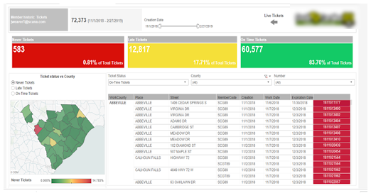
Fig. 4 – Member Dashboard
In this Dashboard, members can do a lot of analysis like the total number of different kinds of tickets, Ticket status vs County, cross tab with country wise ticket details and more. Interactive filters help the members to drill down into the dashboards with their needs for creating different subreports.
When members click on the live ticket icon navigation arrows, they are redirected to live tickets dashboard for the members.
Members view contains information formatted to aid facility operators responsible for locating. These would show at a high level how the user and its company are performing.
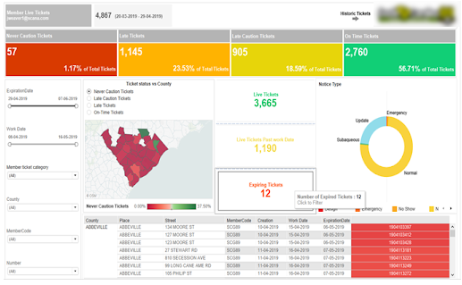
Fig. 5 – Live Tickets Dashboard
Excavator Dashboard
This dashboard view revolves around the person/entity who created the ticket. Excavator dashboard clearly helps track the lifecycle of tickets that are pending, need more attention, requires a positive response from the excavator, and those that passed the due time, etc. This dashboard also drills down the flexibility in each stage of the life cycle for better analysis and quick actions.
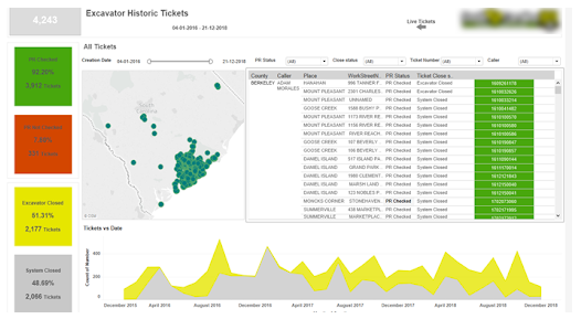
Fig. 6 – Excavator Dashboard
Damage Dashboard for Members and Excavator
This dashboard gives insights into the total damages occurred during the excavation in a plain and understandable way. Damage rate vs date, facility damaged over the years, country vs damages, damages by course, top excavation types causing damages, etc., are all covered in this dashboard.
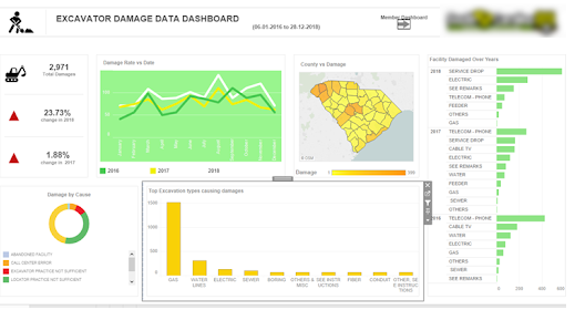
Fig. 7 – Damage Dashboard
The intention here is to give you an overview of what are the various business problems and questions, which can be answered using data visualization in Tableau and how it helped the client to drive business insights from the bulk amount of data in a synchronized way.
Related Reading – Power BI Or Tableau: The Better Choice for your Business
Conclusion
With more businesses going data-driven, the onus is on adopting a wider strategy for keeping data at the very center. Distilling insights from a mix of data obtained from a variety of sources is made easy with intuitive and easy to use BI tools like Tableau. The interactive dashboards in Tableau give rise to a new way to look at data by visualizing them, which refines our understanding of every single metric or KPI that is being displayed. Better accessibility into the dashboards and visualized data even from mobile devices further add to its flexibility.
Tableau comes inbuilt with some powerful BI tools that can do a host of other things alongside data visualization such as data stories, data analysis of workbooks, etc. With it comes the end result of churning out intelligent insights teeming with potential to bring about a transformation into the existing business processes. Besides, there is minimal effort required to start learning and using Tableau owing to its simplicity, easy navigation and other features like drag and drop interface. To sum up, Tableau fully redefines data visualization by helping companies leverage data for creating insights that drive business value. To know how your business can benefit from Tableau, get in touch with our tech experts now!
Stay up to date on what's new
About the Author

Featured Blogs
Stay up to date on
what's new
Talk To Our Experts
A Comparison Between Tableau and Power BI: The Most Powerful Leaders In The BI Market.
Business Intelligence or BI tools are a precursor of the world-altering digital technology in this modern technology landscape. Analytics plays a key role in determining which Business Intelligence tool is a better choice. This is because the more flexible the analytics platform offered by a specific BI tool is, the more it provides businesses to customize applications that need updates. Let’s take a deeper look at how Power BI is different from Tableau and which technology promises a better future for your business.
Related Reading: Read on to learn more about Business Intelligence. What it is and how your business can get the best from it.
Tableau And Power BI
Tableau was the first and foremost to come into the market. Though both Tableau and Power BI are well-known to be able to execute fine enough, Power BI has an advantage of making itself accessible to even the no-techy users, making it possess a higher adoption rate than Tableau.
On the other hand, Power BI is ranked higher on one of the key characteristics in terms of its Data Visualization, according to Gartner’s Magic Quadrant.
However, Microsoft’s Power BI has the most user-friendly features in terms of ‘completeness of vision’ or ‘Data Visualization’ capability and has been embedded within Office 365. But Tableau offers advanced functionality and it is best considered for power users.
So to choose a BI tool that is the best fit for your business, it is important to first learn about the analysis needs. In the recent decade, Power-BI and Tableau have emerged as the two powerful BI tools.
Let us look at how companies can choose the best for their business from the following key factors:
Cost
Cost of Tableau is on the higher side when it comes to larger enterprises. The primary reason for this premium cost is the need to build data warehousing. Thus, it is advisable for a startup to choose Power BI initially and then consider Tableau when required.
The professional version of Power BI costs you less than 10$ whereas, on the other end, Tableau would cost you more than 35$ per month per user.
Reporting
Power BI supports Predictive Modelling and Reporting when on the other side, Tableau opts for Data Visualization.
With Power BI, we can create visualizations by queries and natural language. Say, for instance, Cortana PDA (Personal Digital Assistant). Power BI is said to place a 3500 limit when it comes to conducting analysis on data sets.
Tableau can be the best choice when it comes to Data Visualization. With a user-friendly dashboard, Tableau allows an in-depth data analysis. As compared with Power BI, Tableau offers more visualization flexibility.
With Tableau, we are able to create 24 different types of basic visualizations. This includes heat maps and line charts.
Functionality
The functionality associated with Tableau with respect to Data Searching is on the higher side than when compared to that of Power BI.
Tableau tends to answer more queries from users as compared to Power BI.
Large Data Handling Capacities
In case of processing large chunks of data, the capacity of Tableau is over and above that of Power BI.
Power Bi handles data via import functionality and hence is slower to process large volumes of data as compared to Tableau that makes use of direct connections for the same purpose.
Data Connectors
Tableau offers, convenience for data connectors. For example, OLAP (OnLine Analytical Processing), cloud and also big data options such as Hadoop and NoSQL. Tableau can automatically determine the relationships of data that users add from various data sources. It also provides for the creation and modification of data links manually as per the company policies.
Power BI, on the other hand, can connect to user’s external sources such as SAP HANA, MySQL and JSON. It helps users connect to third-party databases and online services like Salesforce.
Thus, if connecting to a specific data house is your business requirement, Tableau is the best choice as Power BI is integrated with Microsoft’s Azure cloud platform.
Related Reading: Business Intelligence or Business Analytics. Find what is best for your business.
Deployment
Power BI is a SAAS model. Tableau, on the other hand, is available both on cloud and on-premises options. The deployment options for Power BI is lower as some business policies do not allow for SAAS deployment. Thus, in case of flexible deployment capacity, Tableau is considered the better option here, even though it is on the higher-end when the cost factor is considered.
User Interface
The user interface of Tableau allows for the creation of a customized dashboard. On the other hand, Power BI has an interface that is easy to use and intuitive. So, if easy to use is your major requisite, Power BI is the choice for your business.
Programming Tools Support
Though both Power BI and Tableau run smoothly with programming languages, Tableau can be integrated better with the R language rather than Power BI. R language provides a wide range of tools used to capture the right model of your data.
Power BI, on the other hand, also can be connected to the R language, but by using Microsoft Revolution analytics and it is made available only for Enterprise users.
Product and Customer Support
Tableau emerged in an early stage than Power BI and hence has a smaller community when compared to Tableau. The knowledge base of Tableau has three subscription categories, namely Desktop, Online, and Server.
On the other hand, Power BI offers a support functionality that is limited to users with a free account, allowing only it’s premium and pro users for faster support.
Licensing
This ultimately depends on whether you want to pay the full cost up front. If yes, then Tableau should be your first choice.
If we could put it this way, Power BI can be your best choice if you are a common stakeholder because of its intuitive drag and drop features, for which a data analyst’s experience is not crucial. Tableau can win if your choice is speed and if you have the capital to support.
Related Reading: Find how SAP HANA is becoming the game changer.
In a nutshell, both Power BI and Tableau have different functionalities which depend on the variant business requirements. The best BI tool for your business can be selected only depending on the business requirements. With the help of expert IT consultants, you can make the right choice for your business. Contact Fingent today!
Stay up to date on what's new
About the Author
Featured Blogs
Stay up to date on
what's new
Talk To Our Experts
With data now being a critical source of competitive advantage, enterprises are cutting across size and geographies seeking newer methods to identify and analyze the data they generate. Most enterprise decision makers are now familiar with intuitive graphs, pie-charts, and other forms of visualizations that try to make sense of sales, revenue, and other aspects of company operations. However, the usefulness of such data visualizations depends on the effectiveness of the data, or how the data is used to come up with conclusions. A balanced approach in data visualization and analytics is thus pivotal in formulating an effective data strategy.
Many enterprises confuse data analytics with data visualization. Both allow users to make sense of data and obtain the relevant metrics that helps in better decision making. In today’s age of information overload, where data generated is multiplying every 3 years, interpreting them turns out to be the need of the hour. On the other side, we have these forecasts and projections hinting at an exponential growth in revenue for the big data software market in the coming years. The confusion, however, stems from the fact that both data visualization and analytics represent data in visual interfaces.
While there is considerable overlap between the two, data analytics deals with data at a much deeper level, compared to visualization. An end-to-end business intelligence solution consists not just of the front end dashboard, which transforms data into a visual context, but also tools and algorithms at the backend.
Related Reading: Find out how enterprises are relying on business intelligence platforms to leverage data for driving innovation and growth.
Difference between Data Visualization and Data Analytics
Data visualization represents data in a visual context by making explicit the trends and patterns inherent in the data. Such pattern and trends may not be explicit in text-based data. Most tools allow the application of filters to manipulate the data as per user requirements. The traditional forms of visualization, in the form of charts, tables, line graphs, column charts, and many other forms, have of late been supplanted by highly insightful 3D visualizations.
Data analytics go a step deeper, identifying or discovering the trends and patterns inherent in the data. Data visualizations, while allowing users to make sense of the data, need not give the complete picture. Visualizations are only as effective as the data used to prepare the visualization in the first place. Feeding visualization engine with incomplete data will render half-baked, obsolete, or erroneous visualization.
Moreover, today’s enterprises gather data from multiple sources, and store data in multiple repositories, including many silos. In such a state of affairs, gathering comprehensive data for visualization is a tough ask. While visualization tools mostly deal with raw and unstructured data, end-to-end analytic tools employ data mining algorithms to cleanse the data, evaluates the cleansed data using different evaluation models and software tools, subject it to algorithms, and then decides how to display the results.
Data Integration as the first step of the process
The essential prerequisite of effective analysis is consolidating all data in one central place for effective analytics. While there are analytical engines capable of collecting data from multiple silos, consolidating data in one place enables a “single version of the truth,” preventing duplicating and contradicting data from distorting the visualizations. Until recently, many companies use to aggregate data manually, on an ad-hoc basis, as it was easier this way than invest time and effort in a solution for the same.
However, the sheer increase in the volume of data in recent times makes manual aggregation impossible. A number of software tools and platforms cater to the need, by providing automated solutions. The add-on benefit of such automated solutions is data cleansing, to eliminate misnamed, outdated, and messy data, inevitable in a set-up which involves disparate sources and users.
Data Analysis as the second step of the process
The logical step after aggregating and cleansing data is subjecting the data to analysis or performing calculations on the data. As today’s business environment has grown complex, data analysis also involves complex calculations. The need for speed introduced multi-stage formulas that perform a number of calculations simultaneously. Visualization tools focus on reporting data rather than analyzing it, and as such, most tools are limited, with restrictions in the possible aggregations per formula.
In contrast, truly end-to-end analytical solutions allow users to create complex formulas, working in separate sources. The software undertakes the required pre-calculations automatically, making life easy for the user. Businesses seeking to thrive in today’s fast-paced business environment need analytic tools which update data and facilitate collaboration in real-time. The leading analytics tool in the market today, such as IBM Cognos play into this need, by streamlining available data and leveraging plug-and-play interfaces to derive colorful dashboards.
Companies in the retail sector have already leveraged the power of data analytics to streamline their business processes and thus maximize revenue. Analytics and visualization have aided them discover patterns and actionable insights pertaining to customer behavior helping managers plan and develop initiatives. Find out how retailers are harnessing data analytics to aggregate their customer data for accentuating efficiency and profitability.
Comprehensive business intelligence analytics suites offer predictive modeling and other types of advanced analytics based on complex algorithms compiled using languages such as R and Python. Advanced data visualization, data warehousing and dashboards make up some of the key technologies used by business intelligence platforms currently. The best solutions offer unmatched flexibility to the user, with the ability to combine data any way the user requires or prefers.
Moreover, the latest analytical platforms apply modern tools such as natural language processing (NLP) and chatbots, making it easier for users to perform the required calculation or input their queries with ease. The latest advances, such as location-based intelligence increases the potential of analytics and actionability of the insights in a big way.
Data Analytics or Visualization: Which comes last?
While the most effective visualization is based on the data subject to analytics, visualization need not always be the end of the process or the culmination of the project. Many situations adopt data analytics and visualization in a cyclical spree.
Consider the case of Zao, who runs a host of machine learning and predictive modeling applications to gauge the success of targeted email campaigns. Data visualization enters early in the process, with the analysts pulling out specific variables into a graph to identify any possible correlation, or to identify metrics such as mean and median averages, data spread and standard deviation metrics, to get a sense of the scope of the data.
Both data visualization and analytics deal with data. Visualization tools generate a beautiful and easy to comprehend report, but only robust backend capability, which handles the messy data and processes the data by applying advanced algorithms, gives an accurate report. Data analytics offers the complete picture, while visualization summarizes the available data in the best possible way. The best solutions co-opt both.
Your data is growing at exponential rates. The insights from data can help the managers and business owners make decisions that can improve turnaround times, efficiency and more.
https://www.youtube.com/watch?v=H0jlHlEbURc
[Source: IBM]
Related Reading: Get an insight into the hows of using data analytics to scale and grow your business.
We have a team of business analysts and data visualization experts who can provide you with the visualization of data. We can help you implement data analytics software that provides rich, visual solutions that bring together data from multiple sources to show what’s really going on.
Stay up to date on what's new
About the Author

Featured Blogs
Stay up to date on
what's new
Talk To Our Experts
Traditional dashboards, by definition, were meant to provide an “at-a-glance” view of the state of affairs of a business. As a matter of fact, there were web analytics experts who asserted that a dashboard that does not fit in a single page were not dashboards at all and that they were just reports.
According to Avinash Kaushik, Digital Marketing Evangelist at Google, “If your dashboard does not fit on one page, you have a report, not a dashboard…..This rule is important because it encourages rigorous thought to be applied in selecting the golden dashboard metric.”
Now, if this was just one of the few constraints that applied to the conventional belief in one-page dashboards, it would have been a different scenario. But referring to a constraint, as a rule, leads to the assumption that there is only one possible means to achieve the results. I find that it limits the scope of a dashboard and thus affects the effectiveness.
THE TRANSITION
Given that the purpose of a dashboard is to give an accurate, concise and effective description of what the users want to see, limiting it to pages or screens did not seem to be the brightest of ideas. And apparently, this was not just what I thought. As time flew, and as technology conquered whole new levels, people slowly realized the paradox – In the age of touch screens and interactive user interfaces, having single page dashboards is like owning the old heavy and fist-thick mobile phones in place of smartphones.
Not that the old dashboards did not serve the intended purpose at all. They did justice to what they had to represent in those times. But now, with the changes in technology and data and analytics, we are forced to move away from such principles for a number of reasons.
WHAT LED TO THE PHASING OUT OF ONE-PAGE DASHBOARDS?
One of the major reasons why dashboards longer than a page were considered to be sins was the grudge against “scrolling”. How can we possibly ask them to scroll or navigate when they are looking for information “at a glance”?
But now, with touch screens and gestures, navigation, on the whole, let alone scrolling has become easy as ever. Such kinds of interaction methods have actually extended what users used to consider as single screens. There are many marketing sites as well these days, that make use of vertical scrolling for navigation and have immense traffic. It also shows how people have changed and got accustomed to new ways of technology.
Interactive interfaces
Earlier (much earlier), dashboards were mere static documents with a high-level overview of the data with no chance for the users to interact with it. Then came a little more sophistication with spreadsheet software, having advanced features to make dashboards interactive. Again, there were limitations. So the basic idea of interacting with the data, and being able to extract desired specific information, led to the expansion of the scope of dashboards and without much thought, one-page dashboards can be put out of the picture.
Only the specifics
As is the case with most people these days, lack of time and attention span, limit their ability to view and understand things properly. With smartphones, tablets, and smartwatches, people are seeking only the most relevant information and that’s what they deliver. Only specific or the most critical information is delivered and the rest is only given as a choice (on request). This new ask-and-get mode of information exchange does not really fit well with one-page dashboards. We cannot expect people living in this age to analyze data from a single page, crammed with data, figures and illustrations.
Even with all the technological influences, the purpose of dashboards remains the same – to show the big picture in the easiest, most comprehensive way possible. And today’s technology is a great means to achieve that goal. Dashboards today, do more than just providing insights. They also guide the users through the data and help in making actionable decisions. Single-page dashboards, cannot do any of these and are hence phased out!
Stay up to date on what's new
About the Author

Featured Blogs
Stay up to date on
what's new
Talk To Our Experts
Data visualization and dashboards. The perfect means for communicating ideas and complicated information easily. However difficult it is to explain your ideas, if you use interesting and interactive graphics for it with the help of user-friendly data visualization tools, you can create beautiful presentations and put forth your thoughts easily. But is just making interesting dashboards enough, to make your audience understand and engage with your content?
Along with putting a lot of thought into making graphical presentations, you also need to spend time on getting it across to your audience. It’s a combination of strategies while making presentations as well as marketing them, that make them effective. Here are some quick tips on how to make your dashboards or presentations go viral:
While creating them…
- The right data – While creating your presentations, take a little bit of effort to do research and find out what your target audience is like, and what they might find interesting. For example, if you have numbers, create a context with which the target audience can relate rather than simply giving out the numbers.
- The right graphics – As an extension of the previous tip, the research will do good in case of graphics as well. For example, whether to use complex charts or simple infographics.
- A good story – The data in your presentations can be made more effective if presented in the form of a narrative. The story supported by the numbers will be perfect for emotionally appealing with the audience.
- Interactivity – One of the best ways to engage with your audience is to make your charts interactive. Average charts are no more in the picture these days. You can make your presentation stand out if you make them feel that they are personally part of the discussion.
- Data accuracy – It goes without saying how important it is to present accurate and reliable data to the audience. If by any chance they feel that your data is not credible or unreliable, then they might not come back to you.
While marketing them….
- Buy-ins – Make sure that you display the apt Key Performance Indicators (KPIs) and gain buy-ins from the audience. This is significant from a future perspective as well, as the value of your data will spread around through word-of-mouth, when people discuss your presentation.
- Use social media platforms – Using social media platforms such as Facebook and Twitter, and also the corporate versions of these like, SalesForce Chatter to push your content is a very effective strategy. You can create groups in these channels and post regular updates to keep your audience engaged.
- Round-the-clock accessibility – Make your content accessible from anywhere, from any device and at anytime. The audience should be able to get to your data in a few seconds and with just a few clicks. Or else, you are likely to lose them.
- Fast loading – Just like being able to access your data in seconds, it is also important that you make sure your content page loads quickly. It also shouldn’t crash after a while. These are some of the major reasons why people quit a page or an app.
- Internet platforms – Just like social networking sites, there are many platforms or forums on the internet where you can go live and post your content. Being live, it enables fast responses and results.
Apart from these if you do sufficient research, you will be able to find places where data enthusiasts often meet or discuss data relevant to your business. You can use those channels as well to push out your content.
Data visualization is undoubtedly one of the most effective ways to reach out to your clients or customers. If done properly, with the right tools and in the right methods, it will improve your efficiency and reliability by a large margin. Are you looking to create leverage data visualization for your business challenges? We can help you with it!
Stay up to date on what's new
About the Author
Featured Blogs
Stay up to date on
what's new
Talk To Our Experts
As technology adoption grows globally, data is being generated by enterprises and consumers alike. By 2020, it is predicted that the annual volume of data will increase by a staggering 4300%. For corporations, the key to success will be in making use of this data to derive meaningful business insights, especially by using technology.
Here, we focus on one such organization – Premium Retail, whom Fingent has helped in reducing costs and increasing sales and overall efficiency. Fingent deployed an advanced data analytics and data visualization solutions making use of Premium retail’s data.
Premium Retail Services (PRS) Inc. based in Missouri, is a company that has provided comprehensive retailing solutions for over 25 years for companies like Procter and Gamble, Walmart and Best Buy. Their services include merchandising, assisted sales and training, field marketing etc.
The challenge
When Samsung retained PRS to provide comprehensive field marketing services on its behalf in the US market, it needed to deliver a wide range of capabilities pretty quickly. PRS began by assigning Field Marketing Representatives (FMR) to carry out essential activities across the US. The data associated with this assignment alone was extensive. PRS accesses information on more than 12 vertical retail segments that produce close to 1,000,000 data points per month. Now, PRS realized that this data was a treasure trove of business and consumer insights. However, its ability to use the data for informed decision making and guide assessments was hampered by its existing data management capabilities. Moreover, it used obsolete communication and reporting systems that relied heavily on excessive amounts of powerpoint and excel files. It took a long time to process and it was outdated.
How Fingent helped
Data analytics and data visualization are trusted methods to simplify complex information. Considering the variety, volume and velocity of data involved in PRS’s reporting, Fingent proposed to use these methods to create a solution that would reduce human efforts while increasing data accuracy, clarity and credibility.
After completing an inventory of the PRS systems, Fingent developed a plan to transform an approach that produced extensive amounts of unstructured and complicated data from many obsolete, single-window applications into an integrated and better-organized solution. Fingent found it essential to identify the data touchpoints and create scalable solutions, with automated responses that helped PRS to efficiently produce customized, comprehensible reports.
The different technologies used were as follows:
Programming languages – HTML, PHP, JS
Visualization libraries – d3.js, dc.js
Databases – MySQL, Apache
The impact
PRS, through the customized web application that Fingent created, was able to efficiently convert large volumes of data into user-friendly visual representations. This enabled easy analysis of data in different permutations. The data was presented through interactive displays of charts, tables and graphs that highlight what is significant.
This application helped PRS to manage its field marketing personnel by letting managers easily bring performance metrics into the reporting tools they already had. Moreover, the users were able to customize how information was presented to them in a personalized dashboard according to region, role, department or other attributes.
The benefits that PRS derived from this application include:
- High-quality data – Through rigorous analytics, PRS was able to achieve high-quality data, reduce errors and improve consistency
Refined business processes – Through pattern analysis issues can be identified and solved in real time - Bringing out significant insights – Through identification of trends and patterns, significant insights are brought out improving data transparency and accountability
- Easy data management – Time spent on data management is significantly reduced as have related costs. System reliability is improved
On the whole, with the custom web application developed by Fingent, PRS was able to reduce the human efforts involved in analyzing the enormous volumes of data that PRS managers received on a daily basis. It also helped PRS to restructure its business process into a more viable and effective model which has significantly increased its revenue generating capacity.
Stay up to date on what's new
About the Author
Featured Blogs
Stay up to date on
what's new

