Tableau Dashboards To Streamline Data Visualization
Step-by-Step Guide To Using Tableau In Data Visualization
Organizations now have access to more data than before. Earlier, data were not considered important enough and remained severely underutilized. Today, we witness a complete reversal, as data have become a pivotal element in innumerable processes governing an organization’s functioning. This value is not simply a result of procuring data on unclassified stacks, but assimilating them and gathering the needed insights that potentially bring about transformation.
Insights from data are made discernible and are put into plain view via dashboards. They bring into place a new way to understand complex data sets by projecting the values into visual forms like charts, graphs, bars, lines, dots, etc., known as data visualization. The process collates data in varied forms from a broader web of sources to unravel insights. To assist with this is a plethora of business intelligence tools that companies can utilize to visualize their data sets.
Tableau has emerged as a leader among business intelligence tools and stood out from other BI platforms, chiefly because of its powerful, interactive visualization dashboards that discern and quantifies complex data sets into easily understandable visual forms. Being a market-leading business intelligence platform, Tableau aids individuals, teams and organizations visualize and analyze their data. Its interactive dashboard allows analysts to engage with live data sets to get a better overview of the results.
Owing to its innovative and embedded analytics platform, Tableau has been featured as the best in its category by the global market research firm Gartner. Accordingly, Gartner’s Magic Quadrant for Analytics and Business Intelligence Platforms mentioned Tableau as a leader, consecutively for the sixth time based on its customer-focused innovation and real-world value in helping data-driven enterprises solve their business challenges right away.
Related Reading – Five Questions to Ask While Considering Data Visualization Tools

Fig. 1 – Gartner Magic Quadrant for Analytics and Business Intelligence Platforms, Source – Gartner
Tableau combines laser-focus, efficiency and feature-rich elements that determine how people see and understand data. All this comes integrated into a robust and scalable platform, that lets you harness data needed to run even the world’s largest organizations. What Tableau brings to the table is an interactive experience, where we can directly control or modify the data sets in real time to extract intelligent insights instead of just viewing them on the dashboard.
Tableau Dashboards
The worksheet, dashboards and layout containers constitute the three main elements of Tableau. The powerful dashboards integrated with Tableau remain one of its core components. It essentially simplifies the process of quantifying data through features like drag-and-drop and side-by-side comparisons. Such an approach towards understanding data allows more transparency in business processes, which lets you closely monitor, evaluate and forecast performance levels.
Together all the worksheets when combined together form the basis for a dashboard. Every single worksheet contains visualizations of data obtained from a range of sources, which can be grouped together to create a single dashboard. You can even include several dashboard objects that enhance the interactivity and visual appeal. Layout containers, whether horizontal or vertical perform the role of clustering objects together that helps change how the dashboard responds in accordance with user navigation.
Tableau’s dashboards also take visualization a cut above through its several built-in features like story points and device designer. They bring into the picture an overview of all the metrics and KPIs that define a process that helps with forecasting. Later on, a business can utilize these data to put up a comparison with the previous values and ascertain the effect of each action as well as find ways to improve them.
Related Reading: Business Intelligence Vs Business Analytics – What’s Best For Your Business
How to Use Tableau?
You just need to follow the below 3-step mantra to use Tableau:
- Connect to data
- Play around with the UI
- Create visualizations
1. Connect to Data
Connect to your data is the initial thing to do while starting to use Tableau. Connections mainly come in two types – to a local file or a server. Tableau can connect to almost any type of data server. Listed below are some of the popular databases that Tableau can connect:

2. Play around with UI
Once we import the dataset, a “Go to Worksheet” option is displayed next to the Data Source Tab at the bottom portion of the screen. A worksheet is a place where we create all of the graphs, so click on that tab to reach the following screen:
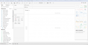 Fig. 2

Fig. 3 – Show me option in Tableau
3. Create Visualizations
Choosing the right visualization techniques for conveying insights in the most effective way is a challenging task. The below table will give you a brief idea about opting the preferred visualization method:

Insights from Using Tableau – A Typical Use Case
The working of Tableau is best understood through an example where there are different data types, each of which has the potential to reveal valuable business insights. Fingent helped one of their clients drive important business decisions by visualizing their secured and dynamic data based on their requirements.
Business need: Being part of an extremely dynamic industry, tracking the slightest changes in their ticket status is of the highest priority for the client. They needed a solution that will enable them to react quickly to varying stages of their tickets and to reduce damage. A solution that would be able to generate hassle-free, ad-hoc & secured reports for delivering accurate data visualization.
Solution: As per the requirements gathered, several dashboards and reports were designed for various levels by connecting to the Microsoft SQL server database. Refer to the screenshot below to understand how our client made use of Tableau to derive insights.
Member Dashboard Created For Fingent Clients
Member Dashboard consists of two tabs: Live tickets and Historic ticket. This dashboard visualizes the history data to derive insights for making better business decisions.
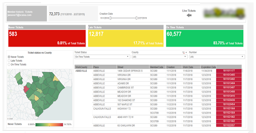
Fig. 4 – Member Dashboard
In this Dashboard, members can do a lot of analysis like the total number of different kinds of tickets, Ticket status vs County, cross tab with country wise ticket details and more. Interactive filters help the members to drill down into the dashboards with their needs for creating different subreports.
When members click on the live ticket icon navigation arrows, they are redirected to live tickets dashboard for the members.
Members view contains information formatted to aid facility operators responsible for locating. These would show at a high level how the user and its company are performing.
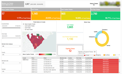
Fig. 5 – Live Tickets Dashboard
Excavator Dashboard
This dashboard view revolves around the person/entity who created the ticket. Excavator dashboard clearly helps track the lifecycle of tickets that are pending, need more attention, requires a positive response from the excavator, and those that passed the due time, etc. This dashboard also drills down the flexibility in each stage of the life cycle for better analysis and quick actions.
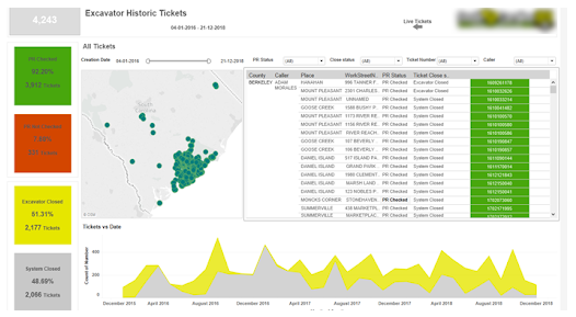
Fig. 6 – Excavator Dashboard
Damage Dashboard for Members and Excavator
This dashboard gives insights into the total damages occurred during the excavation in a plain and understandable way. Damage rate vs date, facility damaged over the years, country vs damages, damages by course, top excavation types causing damages, etc., are all covered in this dashboard.
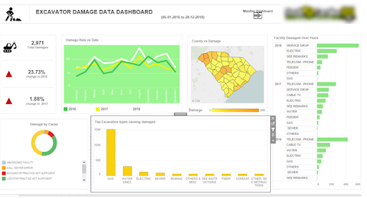
Fig. 7 – Damage Dashboard
The intention here is to give you an overview of what are the various business problems and questions, which can be answered using data visualization in Tableau and how it helped the client to drive business insights from the bulk amount of data in a synchronized way.
Related Reading – Power BI Or Tableau: The Better Choice for your Business
Conclusion
With more businesses going data-driven, the onus is on adopting a wider strategy for keeping data at the very center. Distilling insights from a mix of data obtained from a variety of sources is made easy with intuitive and easy to use BI tools like Tableau. The interactive dashboards in Tableau give rise to a new way to look at data by visualizing them, which refines our understanding of every single metric or KPI that is being displayed. Better accessibility into the dashboards and visualized data even from mobile devices further add to its flexibility.
Tableau comes inbuilt with some powerful BI tools that can do a host of other things alongside data visualization such as data stories, data analysis of workbooks, etc. With it comes the end result of churning out intelligent insights teeming with potential to bring about a transformation into the existing business processes. Besides, there is minimal effort required to start learning and using Tableau owing to its simplicity, easy navigation and other features like drag and drop interface. To sum up, Tableau fully redefines data visualization by helping companies leverage data for creating insights that drive business value. To know how your business can benefit from Tableau, get in touch with our custom software development experts now!
Stay up to date on what's new

About the Author

Recommended Posts

16 Mar 2022 B2B
Maximizing Business Potential with Process Automation and Visualization!
Businesses are always on the lookout for ways to optimize processes and gain greater visualization. When processes work efficiently, the output of the product is higher. This leads to workflows……

05 Jun 2020
A Simple Guide on Understanding Exploratory Data Analysis
What is Exploratory Data Analysis? Exploratory Data Analysis (EDA) is a statistical approach used to analyze data and produce descriptive and graphical summaries. Analysts may or may not use a……

06 Jun 2019 Media
Data Visualization: The Future, Predictions And Beyond
Impact Of Data Visualization On Future Technologies Data Visualization is no more art. With emerging cognitive frameworks, multidimensional imaging and intelligence; data visualization is opening new horizons in being able……

14 May 2019
Power BI Or Tableau: The Better Choice For Your Business
A Comparison Between Tableau and Power BI: The Most Powerful Leaders In The BI Market. Business Intelligence or BI tools are a precursor of the world-altering digital technology in this……
Featured Blogs


Stay up to date on
what's new