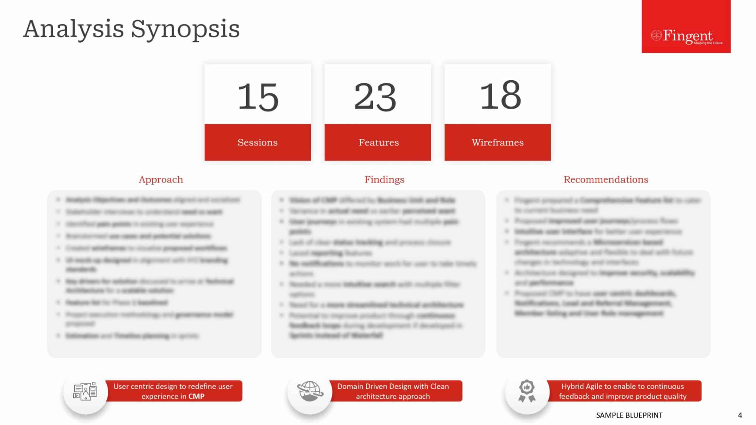
5 Fallacies That Destroy Your Website Design
Several statistics prove that almost 75% of website users judge the efficiency and credibility of a company by its website design. That pretty much shows how important it is for a company to have a well-designed website. They are undoubtedly one of the main factors in improving business. However, it is also one of the most overlooked aspects of a business. Managers and Chief Executive Officers (CEOs), often do not spend much time on their company’s website. Even though they realize how important it is for their business, all they do is simply hand over the job to the designers and forget about it.
What people seldom notice is that there are a lot of misconceptions around how websites are built these days. Some of these can even cost the company their relation with designers when the final design is a mess and doesn’t attract people. In turn, the company might just lose its prospective clients.
Here are 5 of the most common misconceptions that companies should probably watch out while designing their website. And if you are a designer, these points will definitely teach you what not to do while working on your new project.
- ‘Fancy is better’ – Most often client companies feel that their newly designed website is not good enough, or not worth their money when their designers submit a minimalistic design. The truth is that minimalism is actually the “in thing”. White spaces in websites are often considered to be the signs of a poorly designed website, but the fact is that users find such websites more appealing and beautiful. It is as a matter of fact, quite OK to have white spaces in a website as long as everything necessary has been included. Instead of including extravagant icons and elements, designers need to focus more on making websites simple and perceptive. Moreover, simple designs contribute to a lesser load time, which adds to the effectiveness, as most people tend to leave a web page if it does not load in 4 to 5 seconds.
- ‘What the client likes is what the users will like’ – Most website designers, finalize on the design by taking into consideration the client’s preferences. However, what they like might not always seem appealing to the actual website users. Again, if the company finds a particular design not good enough, then the website as a whole is said to be of bad quality. This too is not good practice, because of the same reason – what the company likes might not be what the users like, and vice versa. Companies need to hire designers that do thorough market research and trust them in providing effective designs.
- ‘Content just needs to have the keywords and can be recycled easily’ – The content of a website is supposed to have the right keywords. True. But these keywords shouldn’t be stuffed into the content for the sake of Search Engine Optimization (SEO). The content should be relevant, reliable, engaging and original. It should also contain the keywords. Also, most designers think it is ok to use already existing content, from the same website. That again is something that affects the credibility of a business. Whether it is from the same company’s website or from some other website, recycled content makes the users bored and also affects the search engine ranking.
- ‘Mobile websites are not necessary’ – A lot of designers focus only on, or more on the desktop version of a website. This practice is no longer a wise move, especially today, when the world seems to be under the reign of smartphones. People need to focus on building mobile responsive websites instead, and make it possible for the users to access the site from anywhere in the world, regardless of the device. Several surveys show that over half of the website users are less likely to become customers of a company that doesn’t have a mobile site or if they have a poorly designed mobile site.
- Bigger logos are better’ – Logos are meant to add brand value and help customers identify unique brands. They are not meant to fill web pages. Adding huge logos to a website, in the hope of being able to grab attention, is a big mistake. It is important to properly design the size of the various elements in a web page in order to make it appealing to users. Having the essential elements in a bigger font and the rest in a slightly smaller font is probably a good way to go.
A good website design is one that will not only be useful and attractive for the users but also conforms to SEO specifications. It will have relevant and original content and shall appear seamless on any mobile device. Companies need to hire designers who know all these and are well aware of the future trends in website design as well.
What other strange website design misconceptions have caught hold of your associates? Let us know in the comments below.
Stay up to date on what's new

About the Author

Recommended Posts

12 Oct 2015
Isomorphic Apps: The Future of Web Browsing
Ok, so we’re all very well acquainted with our friend, the web browser. It has helped us with so many things in life, answered so many of our questions (well,……
02 Oct 2015 Media
5 Designers You Should Steer Clear of
We’ve all had a thousand stories to tell about our clients, haven’t we? From the “oh-so-understanding” perfect clients to the most adamant perfectionists, each client gives us a unique experience……
Featured Blogs


Stay up to date on
what's new