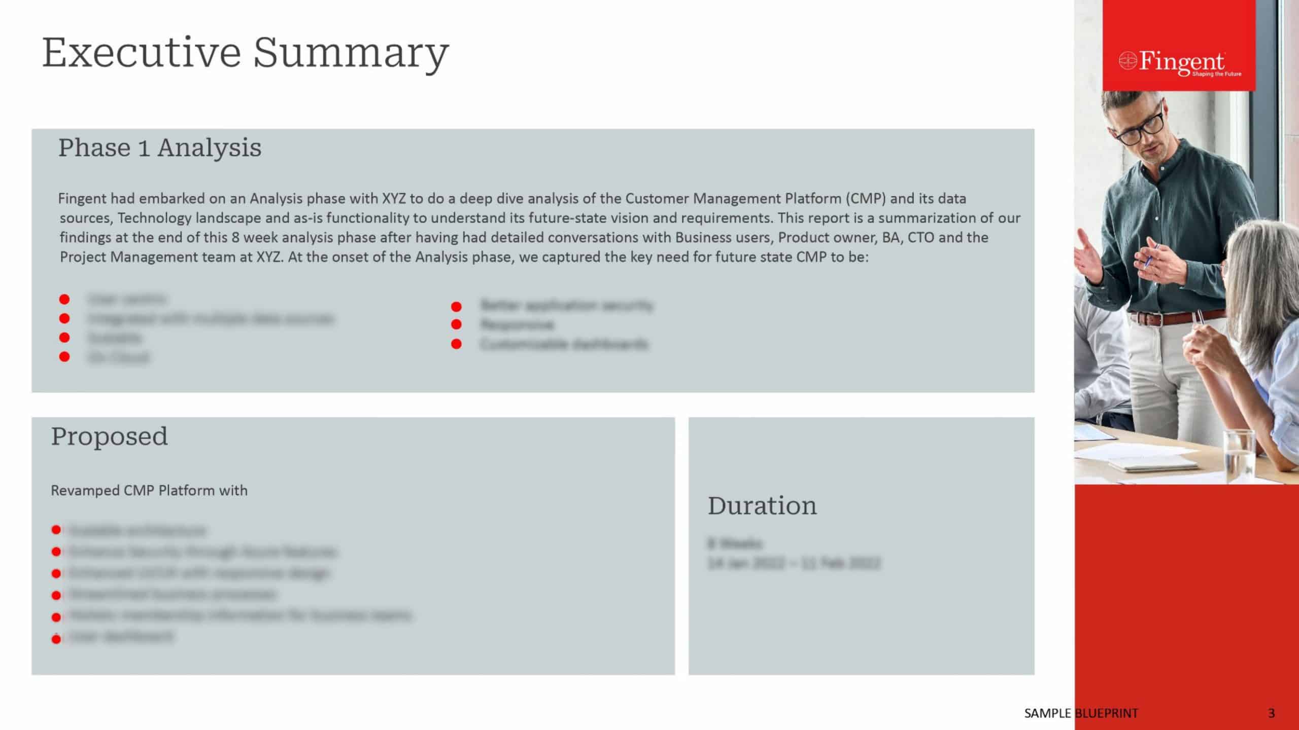
Insights from Designing a Sales Dashboard for a Real Estate Service Provider
Imagine you are a salesman and you have logged into your system with the dashboard pulled up in front of you. Viewing the dashboard with a horde of information on it can turn out to be a very overwhelming experience. Bar charts, pies, metrics, numbers, arrows, percentages, ratios and what not go swimming in front of your eyes. Do they make any sense or do they end up confusing you? Does it include an intuitive interface allowing seamless navigation or is it cluttered and poorly organized? Well, it all depends on how well the sales dashboard is designed.
Recently, Fingent was approached by a client to develop a sales dashboard for their customers who are real estate agents and brokers. The requirement was to develop a portal for the agents and brokers to log into and a dashboard which gives a snapshot of their business performance. With this real estate platform, realtors should be able to access third-party applications to help them with the various stages of their business process.
Related Read: The Tech Disruptors in the Real Estate Space: What to Implement First?
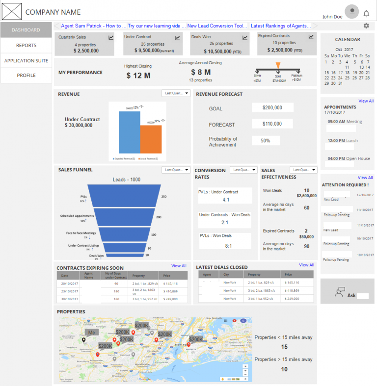
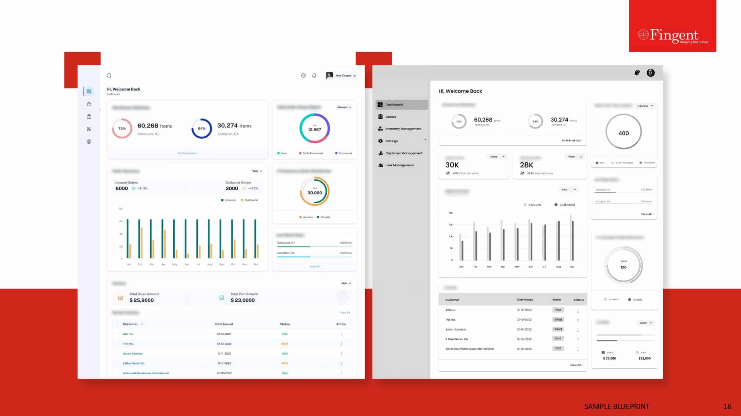
Fig 1. Wireframe of Dashboard Designed for a Real Estate Agent
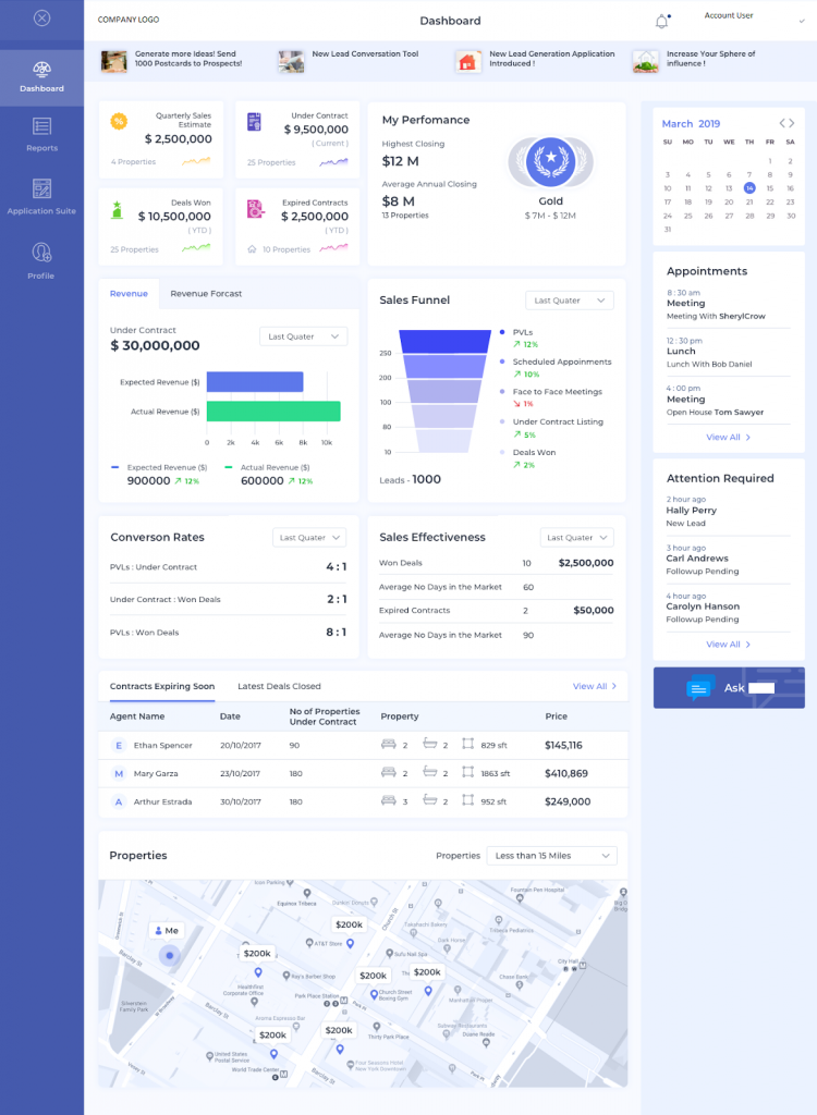
Fig 2. Sample Mockup Designed for a Real Estate Agent
In the real estate industry, data is often unstructured and unaccounted. This platform allows agents to prospect leads, manage and follow up on them, view the status, close on them and ultimately account for the costs and commissions.
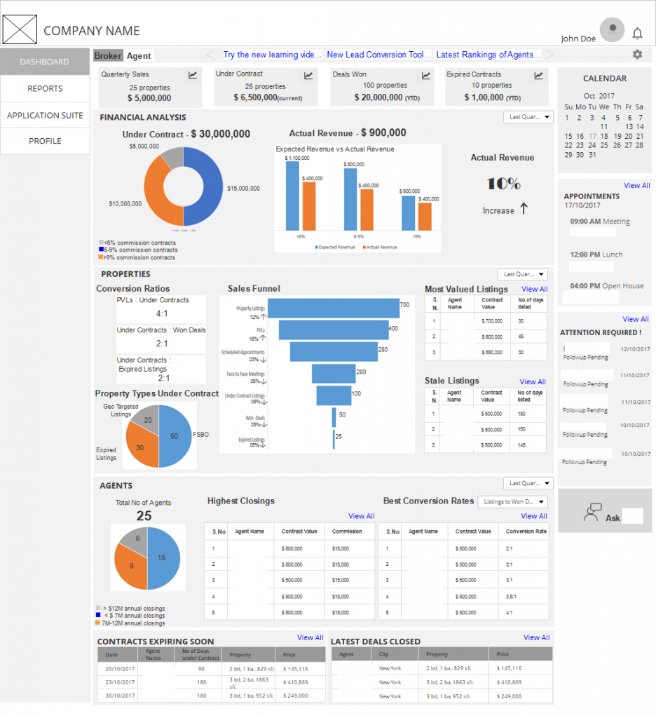
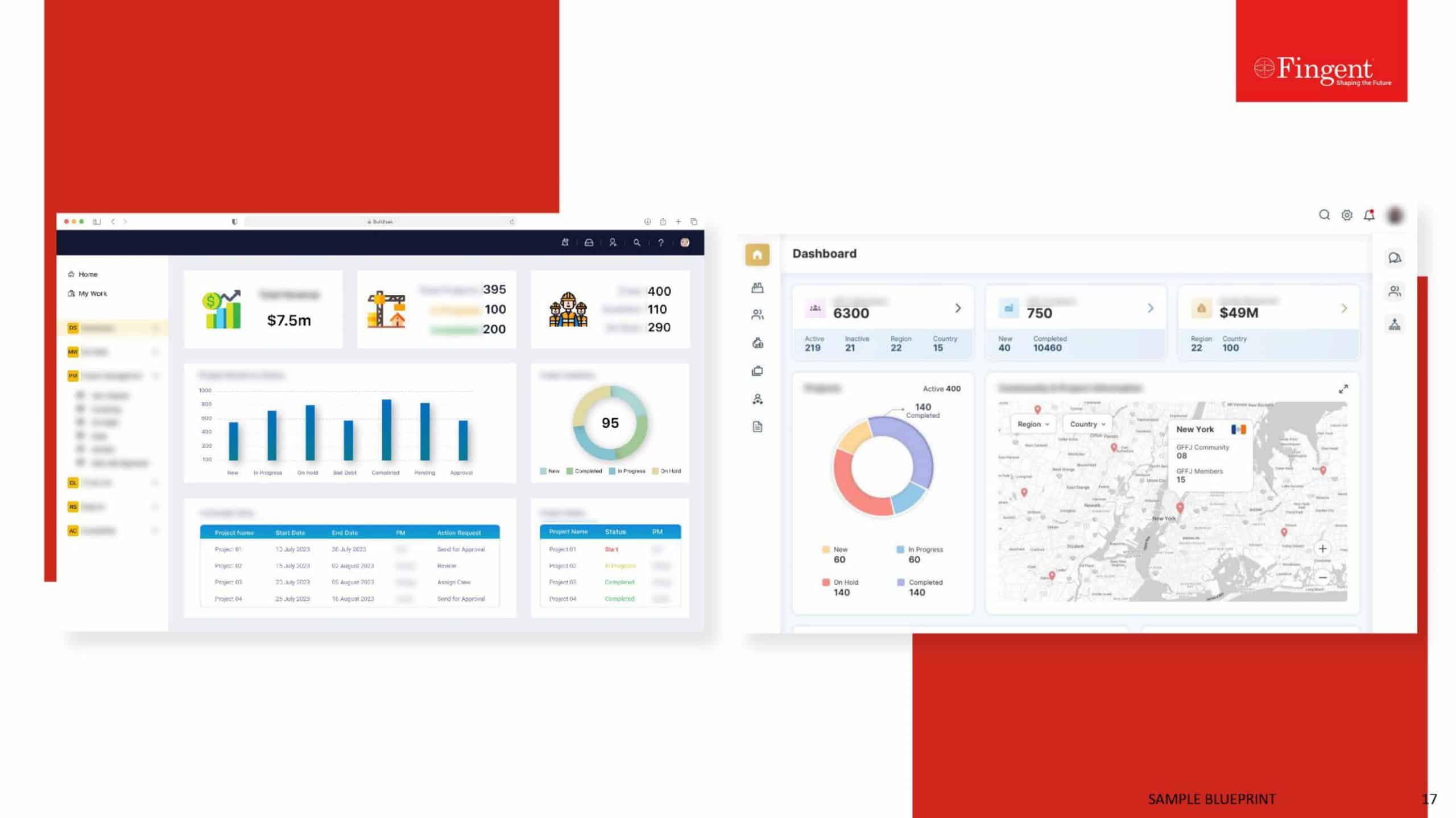
Fig 3. Wireframe of Dashboard Designed for a Real Estate Broker
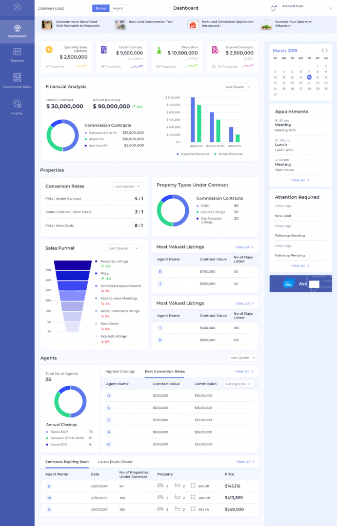
Fig 4. Mockup Template Created for a Real Estate Broker
Expectations from a Good Sales Dashboard
A well-designed sales dashboard is like a good storyteller. It tells you a story complete with the setting, the characters, the main plot, the conflicts, and a conclusion. This should all flow in a seamless, logical way as the eyes of the user move from the top of the dashboard to the bottom; gauging information, which is crucial to making accurate decisions.
Salespeople usually juggle with a lot of numbers. They have numbers related to revenue, sales pipeline, products and services, customer base, forecasts, financial data etc. These numbers help them analyze and make critical decisions on the next move to steer their business forward to success. If these numbers are all scattered around, a salesperson may end up spending precious time gathering data and in the process slip on making important decisions.
Now, imagine if all these numbers come across as a story. Accordingly, the salesperson is able to quickly view the Key Performance Indicators (KPIs) of their business, make a conclusion and plan for the next moves. That is what a good sales dashboard aims to achieve.
A good sales dashboard gives an unbiased true picture of the day to day workings of one’s business. It provides an illustrated view of KPIs and other information crucial in the sales process.
Related Read: Ok Seriously, How Important Is Data Visualization?
Besides, a well-designed sales dashboard should also offer access to real-time data. With this real-time data, salespeople can continually monitor the sales pipeline and activities for making crucial decisions.
The design is yet another leading factor in ensuring better user experience. The logical arrangement of the metrics and other information contribute to effortless navigation all the while ensuring that the most important information is accessed first.
Designing a Sales Dashboard
Now, on the other hand, designing a sales dashboard is an equally daunting task. How do we represent all those numbers in a visually pleasing and logical manner? Furthermore, which numbers to choose from the many, that would ultimately matter the most to the client.
Keeping in mind the following tips will help you design an effective sales dashboard.
1. Getting Your Story Right
A good understanding of the client’s business and its KPIs will help you build the story. Identifying the pulse of the business by tapping on which will give you a correct understanding of the business’s lifeline is the key. Following are some metrics that are generally used in sales –
-
Revenue
This is the key indicator denoting how well the business is doing. Revenue is compared over time (monthly, quarterly, yearly) or with the projected versus actual revenue. It can also be compared to the costs and expressed as a return on investment (ROI). Another way of representing it is to show profits after all the costs are deducted from the revenue. Finding out from your clients which figure would best be useful to them will help you in the design.
-
Forecast
The client can integrate a system to predict their future sales and revenue based on their past backlog, current pipeline, employee performances, market conditions etc. Showing this data on the dashboard will help them see the direction their business is taking.
-
Sales in Numbers and Value
From where is all the revenue coming? Is it from just one product or are all the departments making enough sales? These questions can be answered by displaying the sales in numbers and value. This will give more clarity on the inner workings of the client’s business.
-
Sales Pipeline
The sales pipeline reflects the number of deals in each stage of the sales process. The stages can be open leads, qualified leads, face to face meetings, proposal stage, and closed deals. The number of deals in each stage will help the salesman asses whether they have enough incoming leads to sustain their business, and also whether they have an appropriate distribution of deals to meet their sales targets. It also helps in forecasting revenue in the near future.
-
Lost Deals or Backlog
Negative metrics such as the number of lost deals or the backlog from the previous financial cycle, on the dashboard help in critical decision making. It can tell the salesman where their business is lacking and what it is that they need to focus on.
-
Conversion Ratios
Conversion ratios tell the efficiency of the various stages in the sales process. Numbers such as these – the ratio of open leads to qualified leads, the ratio of qualified leads to closed deals, the ratio of open leads to closed deals etc. help in understanding where the work is getting piled and identifying the bottlenecks faced in the business.
-
Attention Required/Overdue items
Salespeople would appreciate if they can get hold of a list of items on the dashboard, which needs their immediate attention. Overdue tasks is another area which needs to be highlighted in the day to day functioning of the business.
-
Performance
A metric that reflects the sales effectiveness or achievements of a salesperson in line with the company strategy and targets would summarize their performance and also act as a motivating factor to push them towards achieving more.
2. Making Data Comparisons for Deriving Insights
One can gather meaningful insights from data when a comparison is made. Therefore, the way these metrics get compared side by side to derive a logical conclusion is downright important.
Should the metrics be compared with respect to each other? For example actual revenue against forecasted, lost deals versus won deals, sales backlog against the pipeline etc.
Or should it be compared with respect to time? Daily, weekly, quarterly, year on year, year to date etc. Making a comparison should ultimately help the salesperson answer the right questions.
3. Building your Story on Actual Data
Getting real-time data is really helpful in determining the best way of representing it. If it is fictional data, then one must stick to keeping the proportions right. Each chart has a specific type of data that it represents. For example, a pie is used to represent parts of a whole, a funnel represents a progression and a line displays variation over time of different series.
When you use actual data, you tend to realize that some charts do not look as good as you expected and maybe you should think about representing it in some other way. Or, that some numbers are better off shown as numbers itself and not compared to other figures as part of a chart, because it might end up skewing the chart in one direction.
4. Following General UI/UX Principles
Following the general UI/UX principles of good design makes the dashboard visually pleasing and easily navigable. Since most people read from left to right and top to bottom, aligning the widgets on the dashboard in the same order as the story progresses, helps in seamless navigation. The top left space on the dashboard is where the eye falls first. Placing the most important piece of information there ensures high visibility.
Leaving enough white spaces and keeping the dashboard uncluttered will help the user assimilate the information better. A sales dashboard should be concise with just the right amount of information for the salesperson to make an assessment of their business.
5. Keep Reinventing
Nobody gets it right the first time. Redesigning the dashboard a couple of times gives you a better perspective each time and helps you discover the one which will ultimately win your client’s heart.
Related Read: Make Your Data Visualization go Viral: 10 Quick Tips
Wrapping Up
Bringing things into perspective or distilling the essence from a mix of information is what a sales dashboard is all about. Companies have been relying on such visual representations to get an overview of what needs to be done. Particularly in the area of sales, such close visualizations of a range of data can indeed prove helpful for salespeople to gauge information as it is intended and make decisions crucial to the sales process. Owing to its importance, it is downright necessary to build and design a sales dashboard in accordance with certain principles.
By taking into consideration the key metrics that define the sales process, it is possible to delineate the entire workflow and pipeline to an easily identifiable visual form. Such a dashboard brings more clarity in the process, enabling salespeople to understand and apply the necessary changes. We did just that with our client by formulating an effective sales dashboard. This would ultimately help them leverage sales data to contrive practices that push their business forward, all the while accelerating efficiency and ROI.
Stay up to date on what's new

About the Author

Recommended Posts

13 Dec 2021 Real Estate B2B
What’s In Store For Real Estate This 2024?
Across the globe, the real estate industry took a hard hit during the COVID-19 pandemic, which left millions jobless. The huge migration of construction workers affected thousands of construction projects.……

24 May 2019 Real Estate
How Predictive Analytics is Changing Commercial Real Estate
Adoption of Predictive Analytics The Commercial Real Estate (CRE) industry is growing. New business models and competition, extensive use of technology, and changing tenant and investor expectations are redefining the……

20 Mar 2019 Real Estate
PropTech and the Changing Role of Real Estate Agents
Did cell phones really help real estate agents? Yes, without any doubt. Cell phones did transform the industry by taking away all the limitations concerning mobility. Real estate agents were……

21 Feb 2019 Real Estate
How Realtors Are Winning Tenants With Innovative Mobile Apps
Over the years the real estate market has witnessed a tremendous change in the way it runs the business. Intense market competition has compelled the real estate firms to rethink……
Featured Blogs


Stay up to date on
what's new