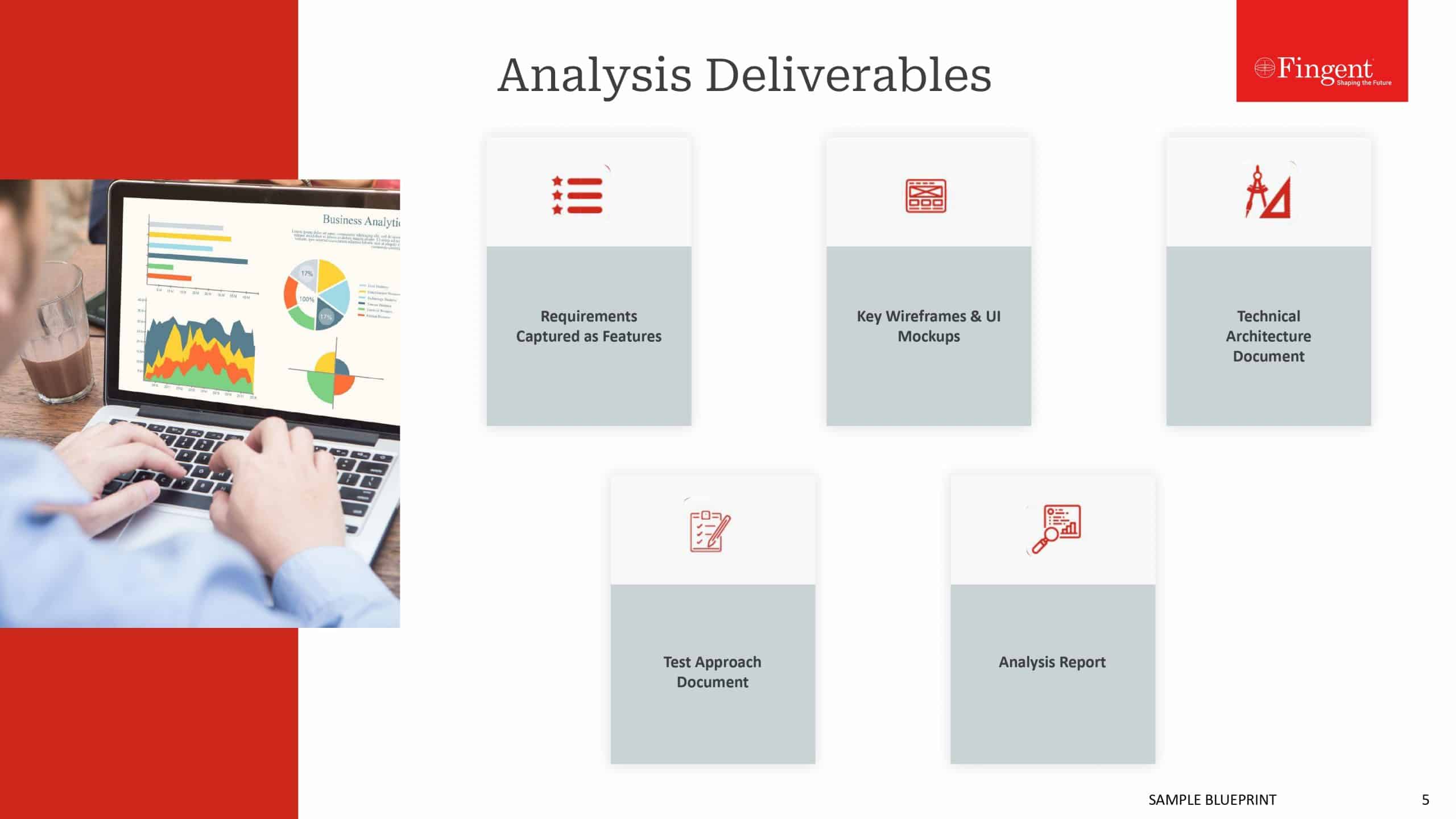
Which is the Best Data Visualization Tool of ‘em all?
Data visualization, in its simplest form, is the representation of information in charts, diagrams, pictures, and other two or three dimensional images. The concept has assumed critical dimensions in today’s information-heavy age, where businesses increasingly rely on actionable insights derived from big data.
Today, powerful tools that crunch raw data and deliver it in the required form, makes the task of data visualization easy. However, even the best of tools are not sacrosanct. Each tool comes with its own set of strong points and limitations. Here is a rundown of the top data visualization tools, used by business managers and other stakeholders to make informed decisions.
Tableau
The Tableau data visualization tool offers some powerful features, including the ability to merge any kind of data with the existing data set, taking analysis to whole new levels. The tool offers an intuitive drag-and-drop feature, making the task of visualization in the required format a breeze. Tableau is rated highly across the board, and anyone, across functions, roles, or industry can easily customize it according to their requirements. Another big plus for Tableau is its robust mobile client, allowing executives to generate highly intuitive visualizations on the move. The free cloud-based version is especially useful for startups and small businesses. The seamless integration with most data types and out-of-the-box integration with most popular Big Data platforms, including Hadoop, is another advantage of Tableau.
Nevertheless, the lack of machine learning algorithms is a big limitation. This means the tool lacks features such as decision trees, CHAID analysis, and K-means. Users requiring such features need to implement the same using R, SPSS Modeler, or Python. The workflow could be smoother, with many dashboard filters remaining convoluted. The range of options in the Histories section is pretty limited. There is no formatting option for individual filters either. Also, the tool is costly for all the features on offer, and leveraging all the features requires sound technical expertise.
Sisense
Sisense scores high in ease-of-use and speed. It is deployable easily and operable even by lay users, without any technical expertise. T he easy nature, combined with real-time analysis capabilities of the tool makes it ideal for business managers who may change their minds frequently, depending on business exigency and the extremely fluid external environment. Static dashboards are passé, and dynamic dashboards that reflect the changed realities of the moment are the order of the day. Sisense caters to this need perfectly, allowing business managers and marketers to create charts and graphs on the fly, when in business meetings or elsewhere. The dashboard aggregates data from multiple data sources at high speeds and also connects smoothly to all data platforms. The HTML5 interface adds to the neatness and simplicity of the tool, without compromising on its power in any way. The flexible pricing plans on offer are another plus.
Nevertheless, there is scope for improvement. The limited export functionality, the convoluted drill-down capabilities, and lack of any out-of-the-box visualization features are some limitations.
Dundas BI
 Dundas BI scores over many other visualization tools in its offering version control, or the ability to roll backward and forward from the dashboard, easily. The easy drag and drop functionality allow users to drop an Excel file and create a data source from it on-the-fly.
Dundas BI is an end-to-end solution, combining simplicity and power. It offers ETL, reporting and dashboard capabilities in a single platform, However, there is still scope for additional functionality. Two glaring limitations are the lack of funnel charts in visualization options and absence of a default a data grid to be collapsed by groups.
Qlik Sense
Qlik Sense scores high on ease of use and flexibility. It offers a robust set of tools to create highly advanced and customized dashboard panels and visualizations, and also add customized graphics, without a single line of code. It offers an intuitive memory tool that generates so lid information, with the possibility of generating in-memory insights using self-service data connections with any database. Qlik Sense’s advanced query-based tools allow users to uncover patterns and relationships across various sources, with considerable ease.
There is, however, a serious limitation of being able to store data results only to a proprietary file, and no other tool, outside of Qlik, can read these files. The flexibility on offer also increases complexity for new users and requires technical expertise to realize.
SAP Lumira
 SAP Lumeria is one of the most powerful tools available in the market, enabling mining and manipulating data in a wide variety of ways. Business executives and data managers may create stories with their data, leading to powerful insights not easily discernable otherwise. For instance, marketers could show the sales across territories and see which ones were performing better than other ones. The tool also facilitates creating dynamic dashboards, and deep visualization capabilities, both customized to the hilt. The charts, graphs, maps and other visualizations on offer integrate seamlessly with third-party APIs. SAP Lumeria can connect easily with any data source.
However, what SAP Lumeria scores on functionality, it lacks in grace. The tool is a bit cumbersome, and not entirely free of bugs. The tool is still in an early stage, so more features and functionality are in the offering, in the coming months.
No data visualization tool is equal. While dashboard customization, data analysis capabilities, and ease of use are the basic functionality expected in the top data visualization tools, beyond such basic functionality, each tool comes with its own set of strong points and limitations. There is, however, no good or bad tool, and the best tool depends on the specific need of the enterprise. Enterprises may do well to create their own custom data visualization tools, attuned to their specific requirements. With our resourceful and experienced team, backed by implementing several cutting-edge projects cutting across industries, we are best placed to partner you in this regard.
Stay up to date on what's new

About the Author

Featured Blogs


Stay up to date on
what's new