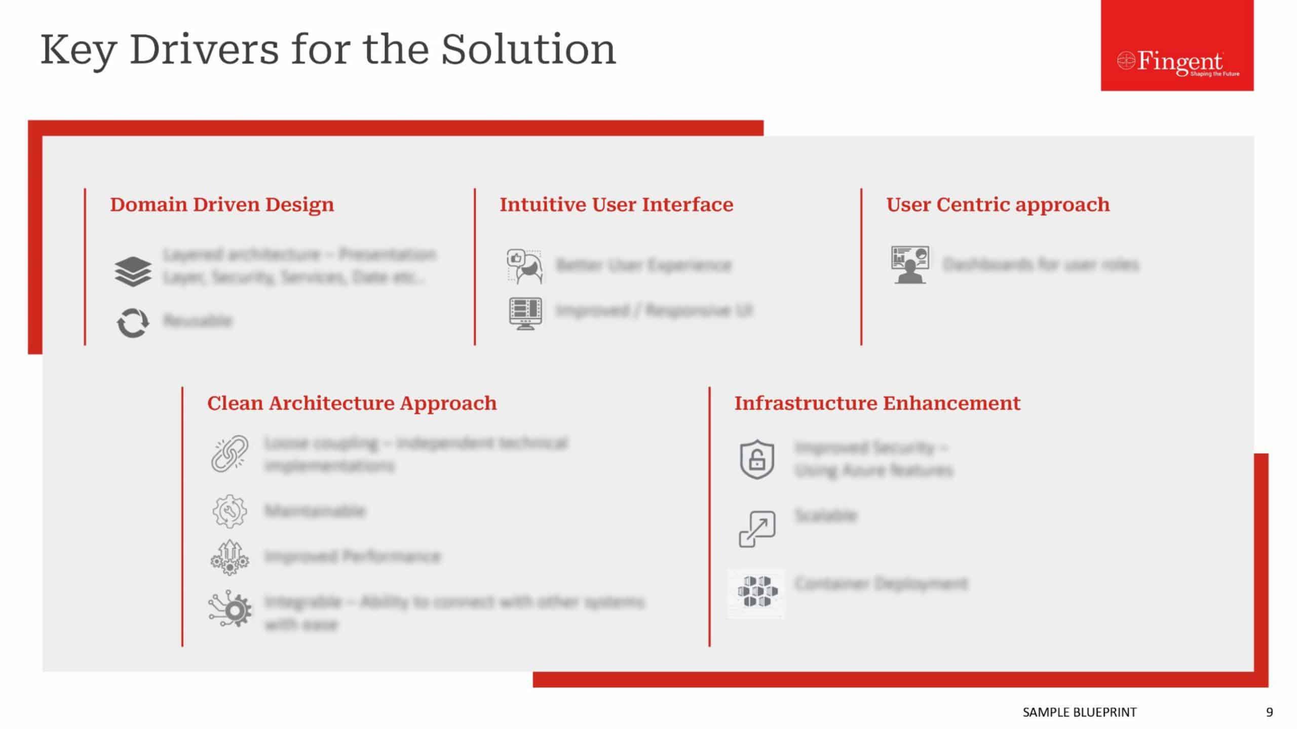
Why choose Material Design over Flat?
When Google announced its plan to start exploring the design field, the effort was very much appreciated and anticipated. Without a doubt, Google’s ‘Material design’ concept released in June 25, 2014 at the Google I/O conference is winning hearts. Material Design unifies Google’s expansive product range across various platforms and devices, under a consistent rich set of digital design styles and principles. These principles are backed with well-planned, solid guidelines that emphasize factors like, color, depth, weight, usability etc.
Is Flat design already on its way to become a passing fad?
When Google first released Jelly Bean, “flatness” was the trend- it said to get rid of whatever possible to make things plain, straight and flat. The design was simple and easy to use with more focus on functionalities, usability, speed of loading and actual working of the interface, compared to the skeuomorphic method which focused mainly on the looks of the interface.
As the name implies, it depicts something that is lying flat on a single surface without any 3-dimensional element in it to render a real world look, or an ability to interact. It was like a black board wiped clean.It removed all appearance styling stuff like gradients, texture, drop shadows and any decoration that imparted a 3 dimensional look for the design, and focused mainly on the interaction of simple icons, candid color schemes and typography. And for the same reason the design was found to be limiting in many cases, constraining us to simple shapes, colors, and icons. Its ubiquity made the sites look so generic, featureless and sometimes like a mid-2010 style if left without timely redesign. Another major drawback was that flat design failed to represent certain sites and apps systematically, which left users like you and me lost and strayed off the flow. It was short of complex visual cues which could actually guide confused users through the process. If you noticed, it was even difficult to distinguish between clickable buttons and static vector graphics because of the unavailability of raised edges and drop shadows. Flat made things extremely flat, that it became too much radical in getting away with all skeuomorphs, even those which were helpful to users. Overuse of the flat design concept began to give sites a monotonous look.
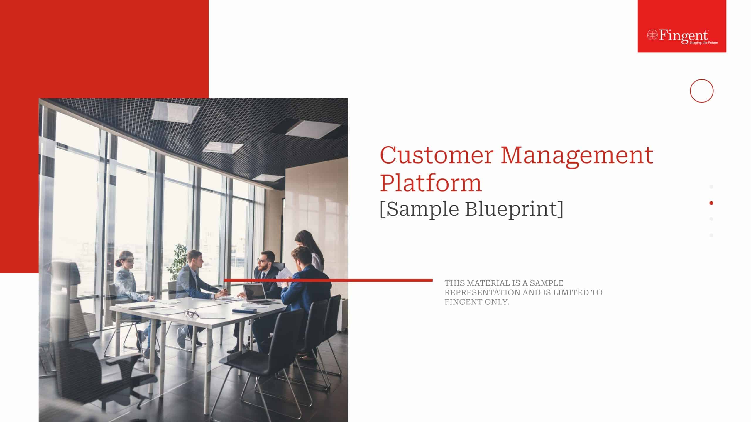
Material Design
Material design, on the other hand, is an evolution of flat design and is multidimensional, taking the 3rd Z axis (apart from the x and y axis) into consideration. Material design makes use of a bit of skeuomorphism and has an element of physics in it. It is based on physical/material objects taking into consideration its depth, edges, shadows, surfaces etc. This allows a more engaging user experience, perfect usability and is like the marriage of real and digital worlds.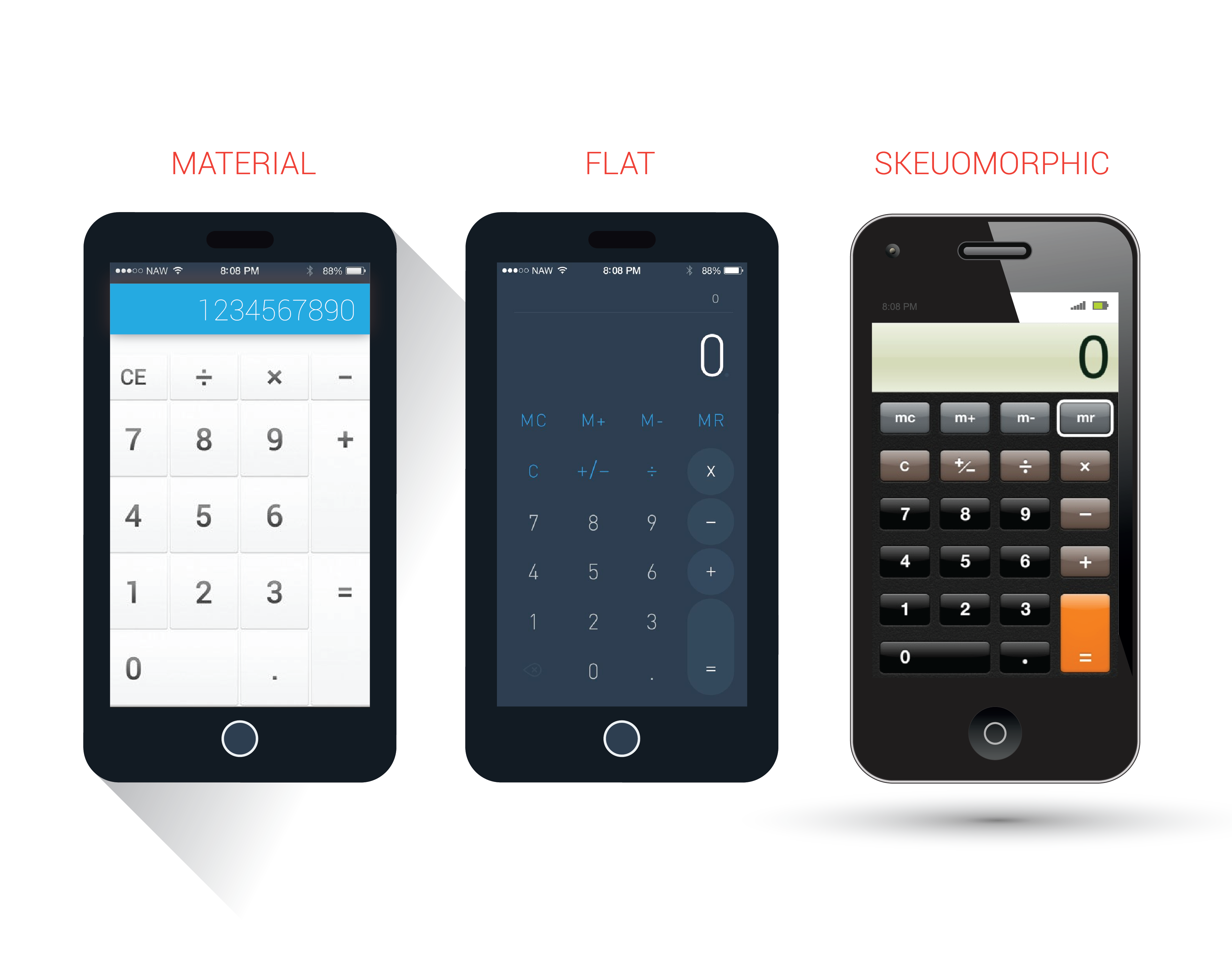
Why/Where should you choose Material over Flat?
- When flat design was perfect for simple designs like logos or graphic design, the complex representations like website design called for a more interactive user experience, something more than what flat offered. Material design thus came in as a reactive response to flat design practices.
- It also helped lessen Android’s design inconsistencies, unappealing themes, lack of proper documentations and overuse of Hamburger menu.
- Though both looks almost similar to a novice, an important difference is that Material Design makes the hierarchy clear with proper use of shadows and lights, which flat did not. For instance, we can clearly understand the position of an object (if it is below or above) simply by the way its shadow has been projected.
- The 3-dimensional arrangement gives a real look and makes it easy to interact with.
- As it has built-in animations, there is no overhead of handling animations manually.
- The extensive use of animations really helps understanding the hierarchy, make things vibrant.
- Material design, sure gives some guidelines, which have been quite a debate point. Some thinks that it’s a limitation to apply your creativity. But in this world with all kind of applications- good, bad, and the ugly, these well-defined principles gives a standardization for designing the apps, it is no more wild guesses anymore.
- Whatever device you design, there are possessing standards available in the design language for every detail.
- Animations are useful to extrapolate to other parts of the design.
- It helped unify how things looked in different android devices. Material design has been a great relief to developers, who struggled to make an app look similar on multiple devices.
Limitations of Material Design
The immense positive responses for material design have virtually erased the negative aspects of it. That doesn’t mean material design come without its limitations. There are a few things that might not please everyone, some are of the opinion that:
- Being so clearly marked the guidelines, they can’t use creativity so much.
- Animations clearly consume more battery.
- The animations and complex graphics can result in slow loading, compared to flat websites that are too fast and easy to use.
- Drop shadow, transform/translate transitions, color fill, can make things jerky and slow. Not all users have extremely fast devices like Google’s designers.
- Overuse of images, colors and animations can be visually distracting.
Both have so much in similar and there is no solid reasoning to choose one over the other. It all comes down to a matter of preference on the designer’s part to choose between a fancy website with colors and animations, and website that is too simple and easy to use. That being said, top designers from leading firms like IDEO, Obvious Corp., Khosla Ventures, Human and more, think that the Material Design is very cool, and most of the popular apps are already embracing the new design language fervently.
Material Design: A passing trend or here to stay?
Material Design has certain elements of fundamental design practices that are strong to stand the test of time, which is why I believe Material design is not just a trend, or being eye-candy. In earlier cases, the success of iOS and crack of Android was based on the UI and UX. But Google has finally come up with a design language that is a perfect response to popular design trends by Microsoft and Apple. It really seems practical from its current popularity and vast adoption, and also has immense adapting capability. Two years down the lane, it might not look the same, but you see, the concept promises a long reign.
Stay up to date on what's new

About the Author

Recommended Posts
05 Apr 2019
Is Good UI Necessary To Retain Your Customers?
Before I give a definite yes or no to this question, let's understand the concept of User Interface or UI. Remember back in the days when owning a Gameboy……

18 May 2017
The Power of UX and UI in Delivering Successful Digital Assets
The success of mobile apps depends on three things: user experience, user experience, and user experience! Even if the app offers very intuitive and powerful features, it is of little……
Featured Blogs


Stay up to date on
what's new