Tag: User interface
Before I give a definite yes or no to this question, let’s understand the concept of User Interface or UI.
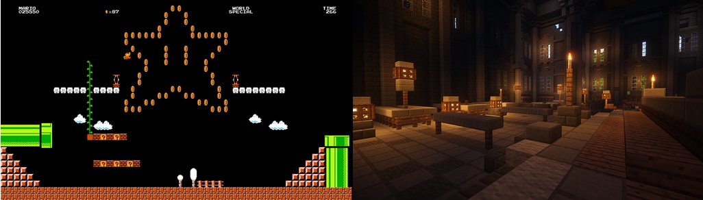
Remember back in the days when owning a Gameboy was as good as an Xbox now, when 30 minutes of Super Mario Land was as intense as a game of graphically dense Far Cry 5 today? Or how uber cool it was to hit your favorite music on a Sony Walkman while you browsed through your myspace account?
Fast forward to 2019, where software is more intelligent and much better looking, even the older millennials cannot ditch their Xboxes to go back to the Nintendo DS nor can they return to myspace from Instagram. Did they love their Nintendos? Yes. Did they enjoy using it even though it wasn’t as graphically demanding? Yes. Then what changed?
All thanks to better UI designers.
Related Read: The Power of UX and UI in Delivering Successful Digital Assets
What Is UI?
UI or User Interface is simply the link between your customer and your product. Whatever elements your customer can see, touch or feel to navigate through your product can contribute to the User Interface. Be it the mobile phone we use, the smartwatch we wear, the car we ride or the websites we use. Everything has a User Interface.
Talking about software, do customers really care what your software looks like or do they just want any platform to get their work done quickly?
The answer is Yes. Customers do care about the interface you provide. Are they aware of it? Probably not.
Psychologically, most users aren’t consciously aware of the interface they use to navigate through the software. It is through their experience on your website that they decide whether to stay or leave. This is where the importance of User Experience or UX comes to play. A well thought of User Interface can subsequently lead to good user experience and can undoubtedly help you retain your users.

Here are a few points that you need to keep in mind when you design your next product to help you retain your customers/users.
1. Take Time to Research
This is one of the most underrated steps in the software design process. Many product teams focus on having the requirements in place and getting work started without “wasting” time. Little do we realize that spending those extra hours in user research and understanding the end user, can do wonders for your product.
Nowadays companies even consult with independent UX research companies that conduct user interviews, focus groups, personas, etc. for them. According to Forrester Research, a good user-centric design has proven to boost ROI and bring up conversion rates by up to 400%.
Moreover, in a study by the Design Management Institute, “design-centric” companies outperformed the S&P 500 by 211%.
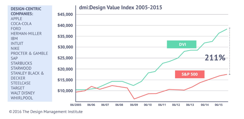
Source – The Design Management Institute
It is imperative that the product that is being delivered to users cater to their needs, accommodate their goals and reflect their behavior in order to make them use your product. A design that does not take into account what the customer wants will only prompt them to move away from your product.
2. Make Educated Decisions
Needless to say, it is absolutely crucial that design teams are aware of the latest trends in software design and are up to date with the current design principles. As a designer, you simply cannot afford to offer a dated solution to your user. So make sure your product team takes that extra step to study what solution your competitors are offering for the same problem and try to come up with a better solution.
This does not mean you need to go over the top with new ideas and designs. For example, a trash can icon is synonymous to “Delete” in the digital world and replacing that with any other fancy icon would only confuse your user.
Some very well thought UI creations that come to my mind are
- Charlie AI
- Samsung SDS Flow
- Airbnb
- Bellroy
- ESPN Sports Programming
3. Use a Style of Communication that Suits Your Audience
Understand your user base and use a communication style that best suits their age and interests. Say for a children’s website or a fashion e-commerce application, a dull downbeat communication style might not sit well with your younger audience and could force your customers to move on to an application they can relate to emotionally.
On the other hand, a professional network like LinkedIn will require a precise and formal tone as the larger audience on it are strictly there for professional reasons.
Using a tone that makes sense to your audience is very important to capture their attention and build trust with them. Users like to know the “people” behind the software and the tone of your website does just that.
4. Consistency is Key
Like we talked about setting a communication style for your website, it is just as important that this style is maintained throughout the website. The importance of being consistent cannot be stressed enough when it comes to optimal user experience. Users tend to use applications that are consistent in their elements, color scheme, typefaces, and interactions.
Say, if your application displays notifications on a side panel, maintain all notifications on the side panel throughout the site. Believe it or not “Your users don’t like surprises”.
5. Include a Knowledge Base
Let’s explain this with an example. Patrick wants to use your application. He loves the concept and the UI design. He can’t wait to start using your app as he has heard it is perfect for his needs. But Patrick has no idea HOW to use your product. He searches for a guide to help him, but found none. Disappointed, he had to move to another application that had a detailed manual.
Now, losing a customer like Patrick is such a shame. Had you spent that extra effort to create a beautifully crafted knowledge base that explains every functionality and feature of your app, you would have retained millions of users like Patrick.
Understand what your users are looking for. If you don’t want to maintain a separate knowledge pile for this, you can add all the information you want to show the user in the UI, by making it seem less like a knowledge base but more like an intuitive design. You could even integrate an AI bot to answer popular queries for you instantly.

When customers are able to find answers to their questions easily and without having to Google/Quora for answers, the overall customer satisfaction increases and also increases user engagement on your website.
Related Read: CTOs Guide – How Robotics and AI Can Improve Customer Experience
6. Less is More Vs More is More
Minimalism isn’t just a fancy word for lazy design. A minimalist design is a visual concept that seeks to embrace simplicity in design, in order to rope in users only towards what is most important.
When catering to a mature target audience, minimalism can be more attractive than a page full of creative design elements, sliding panels, glittering headlines, and modish popups. If your aim is to urge your customers to focus on a particular set of products, minimalist design is the path to choose.
However, it is crucial to understand your customers here. A minimalist design may not work as well for software designed for children, like an educational game. Younger audiences probably would not understand the aesthetic that you are trying to create and may move away to a more attractive website.
7. Improvise and Adapt – The Secret Sauce of Software Design
This is probably THE most important point that businesses need to keep in mind in order to retain their user base for years.
According to a survey by Skype, Adobe, Norton, and TomTom, less than half of the technology users do not like to upgrade software when they should. The simple reason is that people are comfortable with the way things work and do not want to risk getting an update until it’s proven to work for someone else.
On the contrary, users are attracted to new features and functionality as well.
So how do we ensure our software stays on top of its game to an audience that are hesitant to upgrade but wants new stuff too?
Let’s look at the case study of a simple messaging software.
Starting with a messaging platform to simply connect with friends and family via text messages, the team introduced push notifications on mobiles to ensure messages are received even when the application is not running in the foreground. Once the application garnered a few users, more features like photo and video sharing were added and while they were at it, some edit and filter features were included too. Once the application turned out to be an indispensable communication tool for its users, they added voice and video call features.
At this point, users were receptive to all these subtle changes because they hadn’t realized that the application as it was in the beginning, had completely transformed into something much bigger. As far as the customers knew, their experience on the application was flawless. Once the users were comfortable with the current working, the team added group conferencing and even payment integration. Finally, what started as a simple one-on-one messaging app had the potential to replace at least 4-5 apps that were needed every day.
This is the story of how the messaging giant “WhatsApp” increased its user base from a humble 250,000 users to more than 1.5 billion active users standing right next to Facebook and YouTube.
Takeaway – Start by building trust with your customers. Be attentive to your customer’s needs and incorporate improvements without overwhelming the users.
Some popular applications that have evolved into tech giants over time are
- Google Suite
- Adobe Photoshop
- Amazon
- Windows
- Android
- SAP
- iOS
Knowing how to improvise and adapt is the reason these intelligent businesses remain relevant in the market for years.
Related Read: How AI is Redefining the Future of Customer Service
Summing Up
Coming back to the beginning of this article, we asked you why millennials are unable to switch back to older technologies even though they enjoyed the UI at that time. Gameboys for one, were well researched, were consistent, came with a detailed manual and had a great design given the technological limitations of that age. Where they failed to deliver was improvisation. Users are always looking for the next big technological breakthrough.
To stay on top of your game, you must be open to enhance your product for improvements and cater to the continuous cycle of changing customer demands. Product teams should focus on providing users with a flawless experience, be it through the user interface, functionality or customer service. A user-friendly UI is a catalyst for building good relationships with your customers. Retaining your users become easy when you have earned their trust by consistently meeting your customer’s expectations.
By building sustainable software that sees well into the future, we at Fingent top custom software development company, believe our partners deserve the best that technology can offer. Feel free to contact our consultants to get an insight into how we work to deliver your dreams.
Stay up to date on what's new

About the Author

Featured Blogs


Stay up to date on
what's new


Talk To Our Experts
The success of mobile apps depends on three things: user experience, user experience, and user experience!
Even if the app offers very intuitive and powerful features, it is of little benefit unless users are able to make use of the app properly. Today’s mostly harried users have little patience to put up slow loads, confusing menus, half-baked functionality, breaks in the process, or any other glitch, and would just abandon confusing and hard apps.
Even as there is a consensus on the need for superior User Experience (UX), many stakeholders confuse UX with the user interface (UI) and use these two terms interchangeably.
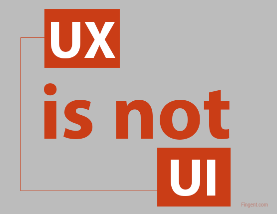
User Experience is much wider than User Interface and refers to designing apps in a way that optimizes usability and accessibility. The overriding aim of a good UX is customer delight, or delivering maximum possible pleasure to the users interacting with the app. UI is delivering a good UX through a good interface. UI may be regarded as one element, albeit critical, of UX.
The Power of User Experience (UX)
User Experience is work “under the hood.” A good UX delivers a neat and simple design that facilitate users to complete their tasks easily and seamlessly.
User Experience focus on the scientific and methodological applying what the target users prefer and industry best practices to the app architecture, to enhance the design and make the app functional and intuitive. It deals with the way product flows logically from one sequence to another, how information is laid on screen, and how people interact with it, aimed at enabling users to complete a specific task in the best and seamless manner possible.
A good User Experience typically ensures the user progresses through tasks and screens in a natural flow, without having to think too much about what they are doing. The effects of a good UX is almost invisible, but the effects of a bad UX manifests quickly, with users often searching on what to do next to complete a task. Obscure or confusing menus, convoluted process flows, poorly visible buttons and more are all tell-tales of a poor UX.
The implications of sound UX go much beyond customer satisfaction though. A lean approach to design contributes largely to faster page load times, at a time when slow-loading websites cost retailers $2.6 billion in lost sales every year.
The Power of User Interface (UI)
The User Interface is more a work of art, aimed at making the interface beautiful. UI concerns with the choice of colors, the style of buttons, the animations and widgets in use, the spacing between elements, click/tap behavior, and other elements that make it easy and attractive for users to interact with the app. The different UI elements combine to enhance the aesthetic flavor of the app. The best UI designs inspire, engage and excite, and create a state of mind where users feel confident of using the app.
There is no hard and fast rule on what constitutes the most potent UI style, but fidelity to the consensus on what constitutes best practices help. Keeping an ear out to the preferences and taste of the target audience of the app or website also helps. For instance, choosing a specific blue over some other hues gave search engine Bing an additional $80 million in annual revenue.
The Conjugation of UX and UI
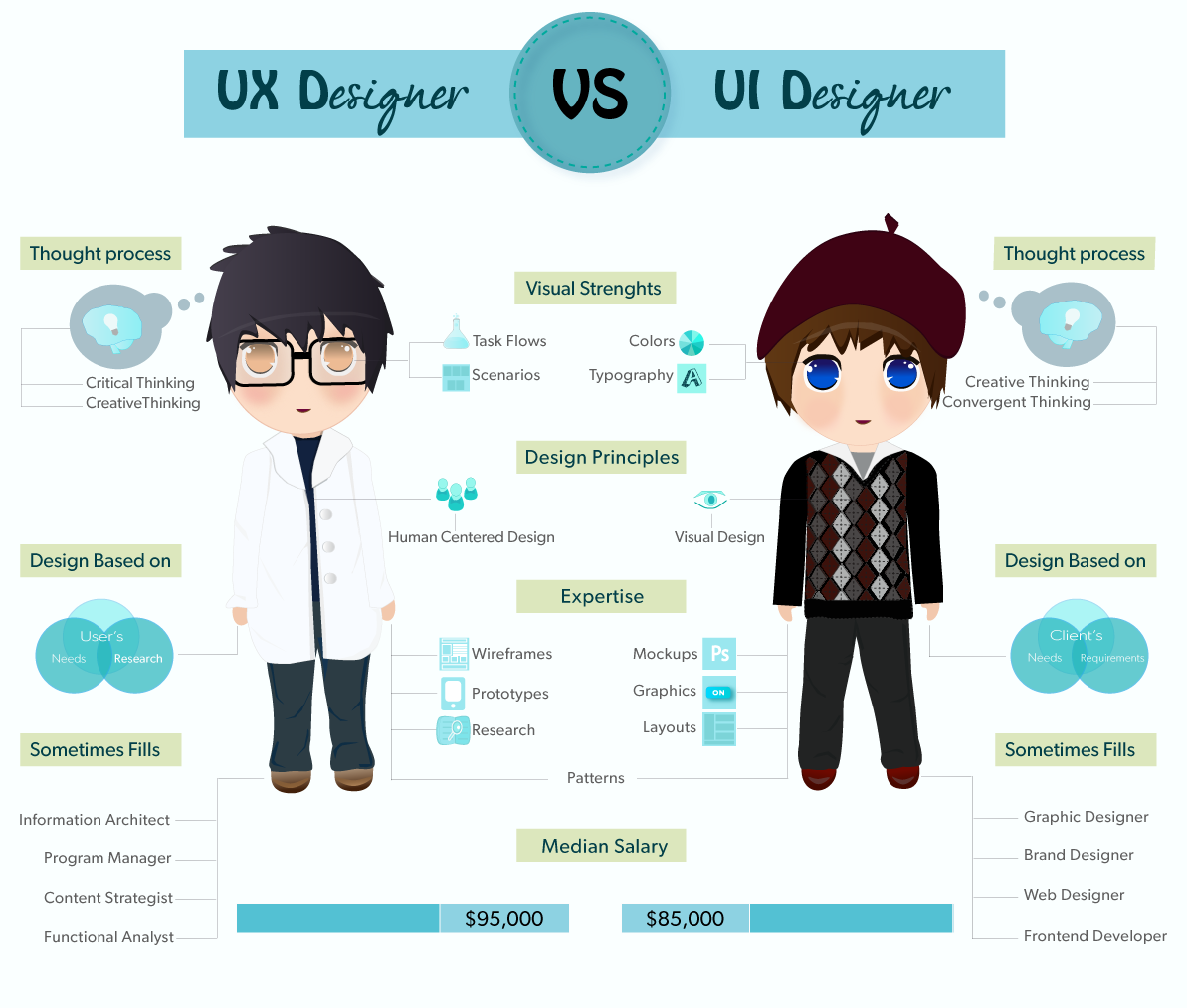
Image Courtesy: Ana Haris
The User Experience and User Interface combine to deliver highly powerful and successful apps that combine functionality with elegance.
User Experience work is about the end-to-end experience when people interact with an app or website, and User Interface work is how users feel about that website as they use it. To illustrate, the UX design may decide users are redirected to another page on tapping a button. The designer working on the UI complements the UX by placing a visual signal, such as a spinning wheel, to convey to the user another page is loading. The UX may adopt a lean philosophy, and opt for simple and straightforward menus. The UI complements through a minimalist interface, with plenty of white space, and minimal graphics that drag down the website and reduce page load speed.
As the adage goes, “well begun is half done.” The robustness of the User Experience and User Interface is decided during the design stage, well before even a single line of code is executed. However, getting the UX and UI right invariably requires teamwork, with contributions from resourceful and talented technical experts, business managers, feedback from end users, and more. It requires talented and resourceful developers, who are not just up-to-date, but know how to apply industry best practices, to ensure a sound UX and UI for the software. With software playing an increasingly critical role in most enterprises, enterprises would do well to rope in external technical expertise, who deal with delivering apps and other digital assets with superior UX and UI, day in and day out.
Stay up to date on what's new
About the Author

Featured Blogs
Stay up to date on
what's new
Talk To Our Experts
When Google announced its plan to start exploring the design field, the effort was very much appreciated and anticipated. Without a doubt, Google’s ‘Material design’ concept released in June 25, 2014 at the Google I/O conference is winning hearts. Material Design unifies Google’s expansive product range across various platforms and devices, under a consistent rich set of digital design styles and principles. These principles are backed with well-planned, solid guidelines that emphasize factors like, color, depth, weight, usability etc.
Is Flat design already on its way to become a passing fad?
When Google first released Jelly Bean, “flatness” was the trend- it said to get rid of whatever possible to make things plain, straight and flat. The design was simple and easy to use with more focus on functionalities, usability, speed of loading and actual working of the interface, compared to the skeuomorphic method which focused mainly on the looks of the interface.
As the name implies, it depicts something that is lying flat on a single surface without any 3-dimensional element in it to render a real world look, or an ability to interact. It was like a black board wiped clean.It removed all appearance styling stuff like gradients, texture, drop shadows and any decoration that imparted a 3 dimensional look for the design, and focused mainly on the interaction of simple icons, candid color schemes and typography. And for the same reason the design was found to be limiting in many cases, constraining us to simple shapes, colors, and icons. Its ubiquity made the sites look so generic, featureless and sometimes like a mid-2010 style if left without timely redesign. Another major drawback was that flat design failed to represent certain sites and apps systematically, which left users like you and me lost and strayed off the flow. It was short of complex visual cues which could actually guide confused users through the process. If you noticed, it was even difficult to distinguish between clickable buttons and static vector graphics because of the unavailability of raised edges and drop shadows. Flat made things extremely flat, that it became too much radical in getting away with all skeuomorphs, even those which were helpful to users. Overuse of the flat design concept began to give sites a monotonous look.
Material Design
Material design, on the other hand, is an evolution of flat design and is multidimensional, taking the 3rd Z axis (apart from the x and y axis) into consideration. Material design makes use of a bit of skeuomorphism and has an element of physics in it. It is based on physical/material objects taking into consideration its depth, edges, shadows, surfaces etc. This allows a more engaging user experience, perfect usability and is like the marriage of real and digital worlds.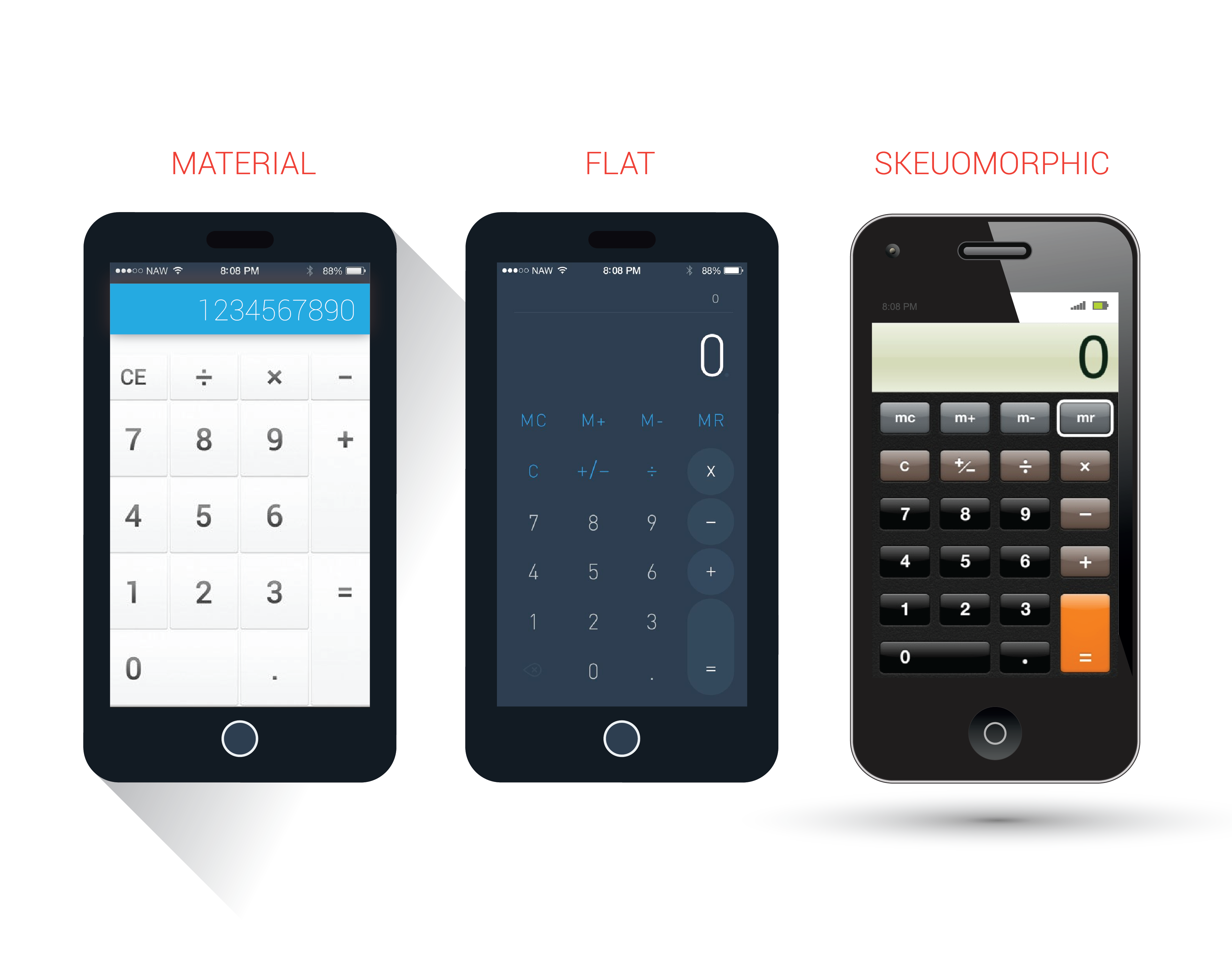
Why/Where should you choose Material over Flat?
- When flat design was perfect for simple designs like logos or graphic design, the complex representations like website design called for a more interactive user experience, something more than what flat offered. Material design thus came in as a reactive response to flat design practices.
- It also helped lessen Android’s design inconsistencies, unappealing themes, lack of proper documentations and overuse of Hamburger menu.
- Though both looks almost similar to a novice, an important difference is that Material Design makes the hierarchy clear with proper use of shadows and lights, which flat did not. For instance, we can clearly understand the position of an object (if it is below or above) simply by the way its shadow has been projected.
- The 3-dimensional arrangement gives a real look and makes it easy to interact with.
- As it has built-in animations, there is no overhead of handling animations manually.
- The extensive use of animations really helps understanding the hierarchy, make things vibrant.
- Material design, sure gives some guidelines, which have been quite a debate point. Some thinks that it’s a limitation to apply your creativity. But in this world with all kind of applications- good, bad, and the ugly, these well-defined principles gives a standardization for designing the apps, it is no more wild guesses anymore.
- Whatever device you design, there are possessing standards available in the design language for every detail.
- Animations are useful to extrapolate to other parts of the design.
- It helped unify how things looked in different android devices. Material design has been a great relief to developers, who struggled to make an app look similar on multiple devices.
Limitations of Material Design
The immense positive responses for material design have virtually erased the negative aspects of it. That doesn’t mean material design come without its limitations. There are a few things that might not please everyone, some are of the opinion that:
- Being so clearly marked the guidelines, they can’t use creativity so much.
- Animations clearly consume more battery.
- The animations and complex graphics can result in slow loading, compared to flat websites that are too fast and easy to use.
- Drop shadow, transform/translate transitions, color fill, can make things jerky and slow. Not all users have extremely fast devices like Google’s designers.
- Overuse of images, colors and animations can be visually distracting.
Both have so much in similar and there is no solid reasoning to choose one over the other. It all comes down to a matter of preference on the designer’s part to choose between a fancy website with colors and animations, and website that is too simple and easy to use. That being said, top designers from leading firms like IDEO, Obvious Corp., Khosla Ventures, Human and more, think that the Material Design is very cool, and most of the popular apps are already embracing the new design language fervently.
Material Design: A passing trend or here to stay?
Material Design has certain elements of fundamental design practices that are strong to stand the test of time, which is why I believe Material design is not just a trend, or being eye-candy. In earlier cases, the success of iOS and crack of Android was based on the UI and UX. But Google has finally come up with a design language that is a perfect response to popular design trends by Microsoft and Apple. It really seems practical from its current popularity and vast adoption, and also has immense adapting capability. Two years down the lane, it might not look the same, but you see, the concept promises a long reign.
Stay up to date on what's new
About the Author
Featured Blogs
Stay up to date on
what's new